Up until the start of “taper trouble” in May, when Federal Reserve Board Chair, Benjamin Bernanke, first uttered what has become the dreaded (oft reviled) “T” word, stocks, funds, and ETFs with a solid “dividend tilt” had been (figuratively) “selling like hotcakes”! Here are just two of the countless statistics I could throw at you to illustrate the magnitude of dividend equity popularity:
1) Since January of 2010, ETF’s built on some sort of dividend stock index or model gathered in over $62 billion of investment assets, bringing the June, 2013 AUM (“assets under management”) for that asset category to a total of over $87 billion!
2) Just this year, the number of new dividend stock ETFs that have been brought to market has been enough to increase the total choices available to investors by a (mind numbing) 75%![1]
As anyone who actively follows the investment industry these days would guess, there is a plethora of “equity dividend strategies” scattered among all of those high-dividend ETFs – each of which (based upon promotional material) is “the best”. In past months, we have featured a number of ETFs that emphasize stocks engaged in “shareholder friendly” activities – such as corporate spin-offs, stock buy backs, or a hiking of the dividend. In this article, I am featuring an ETF that was founded ten years ago this month. I will compare/contrast this ETF with two much newer ETFs that typify two different strategies[2] regarding how to screen and select dividend stocks for a portfolio.
I have been a Certified Financial Planner (C.F.P.) since 1992. On a personal level, I actively began investing in stocks back in the 1970’s. I am a voracious reader and consume large amounts of business and investment material each month. So imagine my surprise when I read this week about an “old line” stock dividend ETF of which I had never before heard! Making this even more ironic is the fact that the index upon which this ETF is built is a descendant of one of the oldest investment resources in the United States – “Value Line”, founded in 1931 by Arnold Bernhard. Our younger readers will stare blankly at the screen (just as my adult children stare at me as though I am the “1,000 Year Old Man”) when I point out that “back in the day” (the 1970’s and 1980’s) thick, heavy reference book binders of “Value Line” reports available at the public library were the closest thing I had to what I now access daily through the internet via YahooFinance.com, SeekingAlpha.com, Fidelity.com (for ETF analysis), etc.
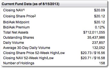 The ETF am highlighting for you today is First Trust Value Line Dividend Index Fund (FVD)[3]. This fund was introduced on August 19, 2003. Here is some basic fund data:
The most important data points here include:
1) $712 million in total assets;
2) Daily volume: almost 238,000 shares;
3) Number of portfolio holdings: 158.
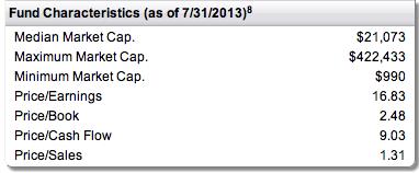
Here is more ETF data, including average, maximum and minimum “market cap” numbers within the portfolio, as well as “value” ratios for the portfolio (note that the $ figures are in “millions”):
 How does FDV select its portfolio components? Here is a concise summary of the steps involved within portfolio construction:
1) QUALITY/SAFETY: After weeding out all stocks not listed on a United States exchange, those stocks that have received a “Safety Ranking” of #1 or #2 by Value Line are set apart for further screening;
2) From among those stocks, Value Line selects the stocks with a higher than average dividend yield (relative to the yield of the S&P 500 Composite Stock Price Index);
3) From within the stocks remaining for screening/analysis, Value Line eliminates stocks with a market cap of less than $1 billion;
4) The remaining stocks are included in the portfolio on an equal-weighting basis.
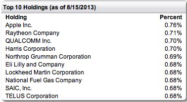
We can easily see the portfolio impact of “equal weighting” within the list below of the “top ten” stocks in the portfolio:
 For the few that do not already know this, the indices with which we are most familiar are “capitalization-weighted” – including the Dow Jones 30 Index (DIA), the S&P 500 Index (SPY), and the NASDAQ 100 (QQQ).[4]
Because of equal weighting, after portfolio re-balancing no single security holds more than 0.7% of the fund’s assets. Obviously, this means that the fund is more “diversified” and “balanced” than any of the standard “big name” indices! Very significantly, this “balanced approach” in FDV’s portfolio management is reinforced and accentuated by the fact that the portfolio is “re-balanced” (based on the index screening described above) each and every month.
Let’s compare the performance of FDV with that of the SPY ETF thus far this year:
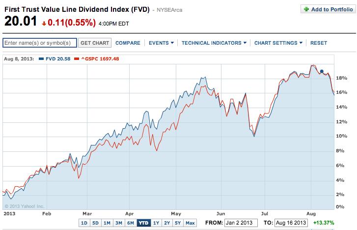
As we can see, FDV outperformed from mid-February through late May (“taper trouble”). But since then, despite the headwinds of dramatically higher interest rates (10 year U.S. Treasury), the price of FDV “hung in there” with SPY, while the dividend is higher than SPY’s by about 0.6% over the course of each year!!
It is also significant to review a longer-term performance range (the 5-year is below):
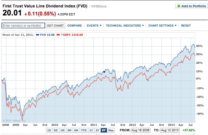
The graph shows an outperformance during these five years of about 10% (in price) – to which one needs to add about 0.5% for the incremental dividend received each year (2.5%, not compounded).
Next, how does FDV differ from more recent “equity-income” indices or methodologies?
The most easily grasped distinction regarding portfolio construction within this asset class can be illustrated through two huge Vanguard ETFs:
Vanguard High Dividend Yield ETF (VYM): $ 6.50 billion in assets
Vanguard Dividend Appreciation ETF (VIG): $16.74 billion in assets (almost 3 times bigger!)
How do these “dividend heavy” ETFs build their portfolio? Lets take a look at the description for each provided through the Vanguard website (as follows):
VYM: tracks the FTSE High Dividend Yield Index—which screens for stocks with higher than average yields, placing a lower portfolio weighting on any stock for which the higher yield is (in part) due to a low or falling price.[5]
VIG: this fund tracks the performance of the NASDAQ US Dividend Achievers Select Index – an index designed to screen for common stocks of companies that have a record of increasing dividends over time.
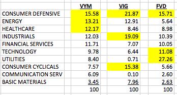 What are the implications of these two methodologies? The “high dividend” fund (VYM) places its emphasis on yield, without reference to growth, while the “dividend achiever” (VIG) fund places an emphasis on steadily growing dividends – implying the importance of earnings growth. The result is a significantly different “weighting” among industry groups within each portfolio. Here are the weightings for the three portfolios, side by side (yellow highlighting indicates the top three weightings in each ETF):[6]
The most obvious differences include the following:
1) VIG has the highest “consumer defensive” weighting because (as the category suggests) it is the most consistent, and therefore has the longest string of unbroken increases in dividends;
2) VIG has the smallest portion of “financials” because so many banks suspended or reduced their dividend between 2008 and 2010;
3) VYM has a higher share of utilities than VIG, because utilities (as a group) pay out at a higher rate;
4) I was surprised that FVD had the highest share of tech stocks. It is interesting that the Value Line methodology works out that way!
Here is (above) a comparative listing of “top holdings” for the two Vanguard funds (see the FVD listing earlier):[7]
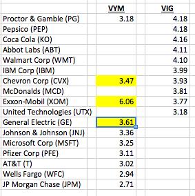
It is well worth noting that FVD is equally weighted (around 0.7% each). That contrasts sharply with VYM, for which XOM is over 6% of the portfolio, and VIG, within which five stocks are weighted at over 4%!
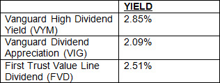
Here is the yield for each (at July 30, per YahooFinance.com):
Finally, with regard to valuation, here is a chart of basic value metrics for each EFT:
 Note that FVD is the most “expensive” relative to earnings, but it falls between the two Vanguard ETFs on the other metrics.
By now you are possibly chafing at the bit to see how these ETFs perform in the open market. In fact, you may already have developed a couple of hypotheses regarding which one(s) might outperform over time.
Let’s assume that you absolutely had to guess which one would do better over a 3-5 year period! Which one would you choose as the top performer?
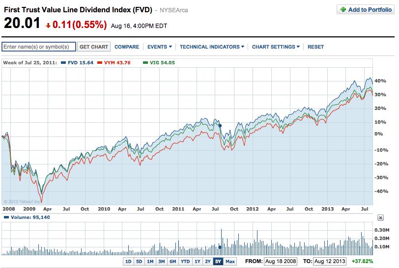
Review the graph below, covering the past five years.
I confess that I did not expect FVD (blue) to outperform VYM (red) and VIG (green)!! That is why I was so surprised I had never heard about FVD until now!
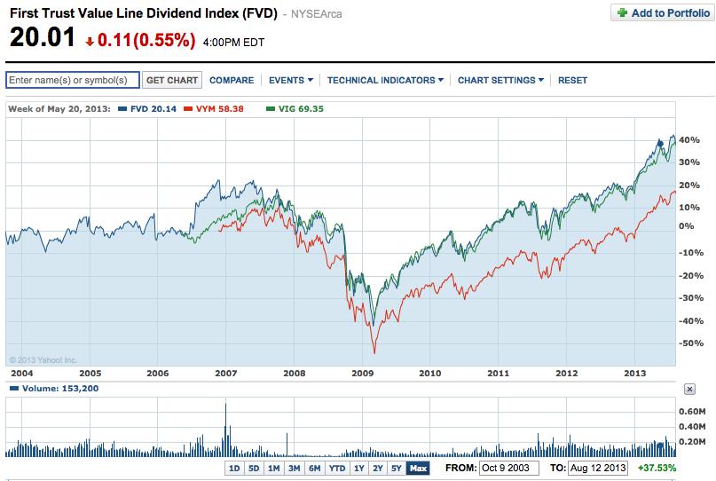
It is also worth noting that FVD is much older than either Vanguard ETF, as you can see below:[8]
You can also see that VIG is the one that most closely “tracks” FVD.
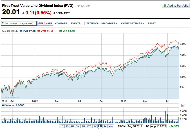
All of this said, it is worth noting that (as you’d suspect), there are variances in outperformance. For example, during the past two years, VYM has performed better (see graph below):
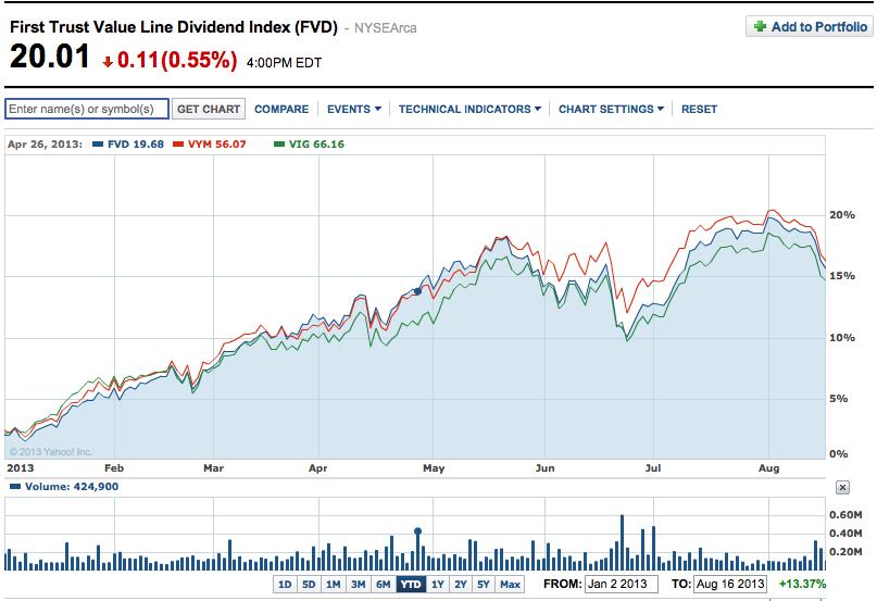
VYM has also done better year to date (but not by a huge measure):
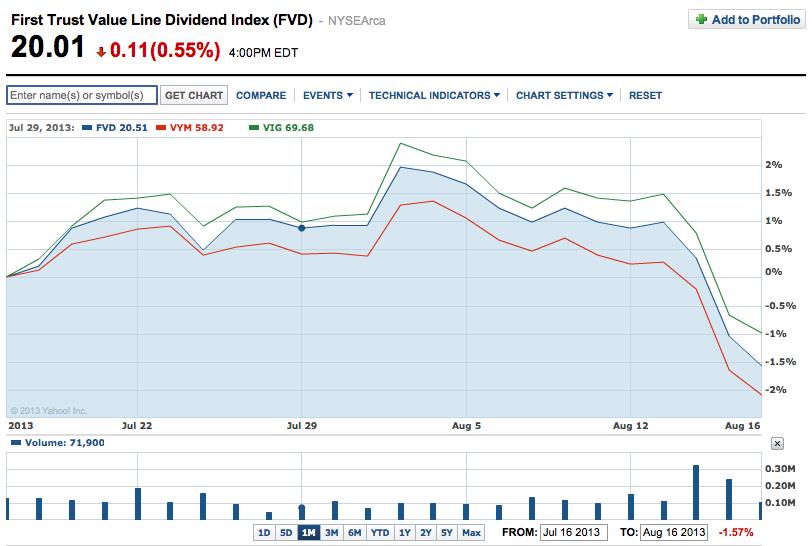
Finally, over the past month, VIG has outperformed both other ETFs!! (see the graph below):
INVESTOR TAKE AWAYS: For regular readers of the Market Tamer blog, it should not come as a surprise that companies which engage in “shareholder friendly” practices (such as a commitment to significant dividend payouts) tend to outperform the S&P 500 Index over time.
What may be a surprise to some of you is that these very differently constructed dividend stock portfolios can demonstrate remarkably similar performance over time. I know that I was surprised that such different portfolios could parallel one another so closely.
One more important “take away” should be that none of us can count on the financial media to regularly alert us to ETFs or funds that are very worthy of attention, as well as consideration for use within our overall investment plan. I suggest to you that the very small (relatively speaking)[9] First Trust Value Line Dividend ETF (FVD) is one of those “under exposed” investment vehicles about which more investors need to know!
DISCLOSURE: The author is not invested in FVD, but does own VIG and VYM, as well as options on SPY. Nothing in this article is intended as a recommendation to buy or sell anything. Always consult with your financial advisor regarding changes in your portfolio – either subtractions or additions.
Submitted by Thomas Petty MBA CFP
[1] For comparison purposes: the number of “fixed income” ETFs has grown by 57% and the total number of industry ETFs (of all varieties) has grown by 37%. All these data points come from iShares, which is the largest issuer of ETFs and is owned by BlackRock.
[2] These strategies are quite commonly used.
[3] Administered, managed, and sold through “First Trust Portfolios L.P.” Access www.ftportfolios.com for more information.
[4] Amazon (AMZN) constitutes 3.86% of QQQ; Exxon-Mobil (XOM) 4.4% of SPY; IBM (IBM) held 9.84% of DIA on June 30th.
[5] A dear friend of mine who is a professional adviser who manages clients’ money would call such a fund a “yield hog” fund. Its emphasis is on high yield.
[6] Data for VYM and VIG comes from YahooFinance.com; data for FVD comes from its website.
[7] The list is sorted for VIG; the top three stocks in VYM are indicated in yellow.
[8] VIG and VYM were started in 2006.
[9] FVD is 8.5 times smaller than VYM and over 23 times smaller than VIG!!
Related Posts
Also on Market Tamer…
Follow Us on Facebook

 3 Things That Need to Happen for Bitcoin to Reach $200,000


