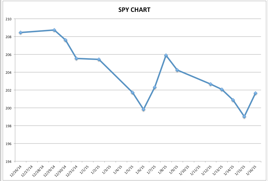
If you have been invested in U.S. equities since December 26th of 2014… you have experienced price movement more akin to a huge “high grade” roller coaster than a functioning stock market.[1] Take a look at this chart of the SPDR S&P 500 ETF TRUST (SPY):
As you may know, this chart doesn’t even begin to illustrate the intraday volatility we have seen within recent market action.
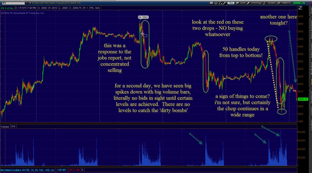
For example, technical analysis expert, Bob Lang (often featured on Jim Cramer’s “Mad Money” within the Off the Charts segment) recently highlighted disturbing instances of extremely concentrated downside action… instances that Bob dubs “Dirty Bombs”:[2]
Bob has marked these “Dirty Bombs” with tall green ovals. Note that the first spike downward came after the release of the Nonfarm Jobs Report (January 9) … and the far right downward move covered 50 points on the S&P 500 Index (not quite like a hot knife through butter – but close!). Notice the simultaneous huge spikes in volume as well!
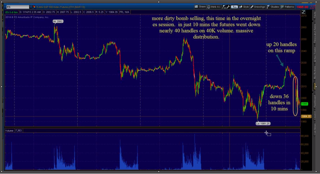
This next chart from Lang shows “Dirty Bombs” from action during the week of January 12-16 … that included the “shot across the bow” from the Swiss Central Bank that “no one” expected:[3]
As you can see in this chart, overnight action witnessed the S&P 500 dropping almost 40 points in just ten minutes on high volume! (Yikes, you can’t even drink a Venti Starbucks (SBUX) Frap in 10 minutes!)
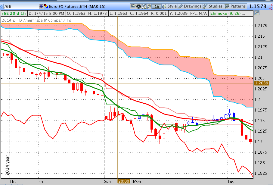
As a brief aside, if you examine (in retrospect, of course) the action in the Euro upon the open on Sunday evening, January 11th … you can see a precursor of the volatility that came later in the week:
Look carefully at the gap between the vertical dashed line and the salmon vertical line (just to the left of center) and note that the Euro suffered a big downward gap at the open![4] Then it recovered to a level it sustained through Monday into Tuesday.
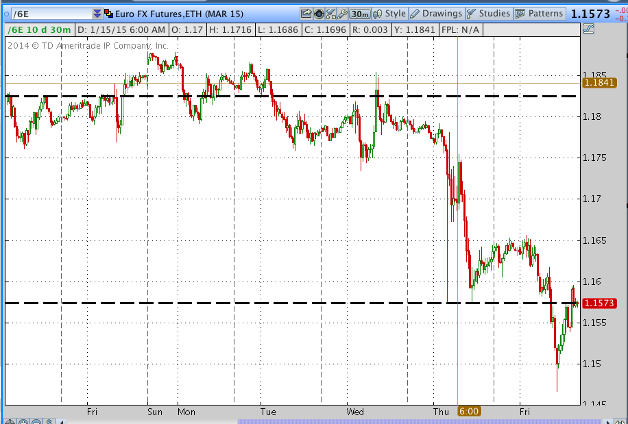
That level (approximately) is inserted into the next chart, showing the price action for the entire week. The big drop in the chart came in reaction to the Swiss Central Bank action – the Euro tanking to well below 1.15 before recovering above 1.15.
Those who lean toward the “conspiracy school” of thinking might suspect that someone had some degree of advance notice of the impending Swiss Central Bank move prior to the Sunday open. Of course, suspecting that the “big guys” know things that you and I don’t know serves to not only add to mistrust of markets, but also to uncertainty and volatility![5]
Before we move on, take another look at the SPY chart between December 26 and January 16:
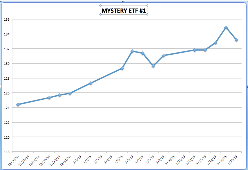
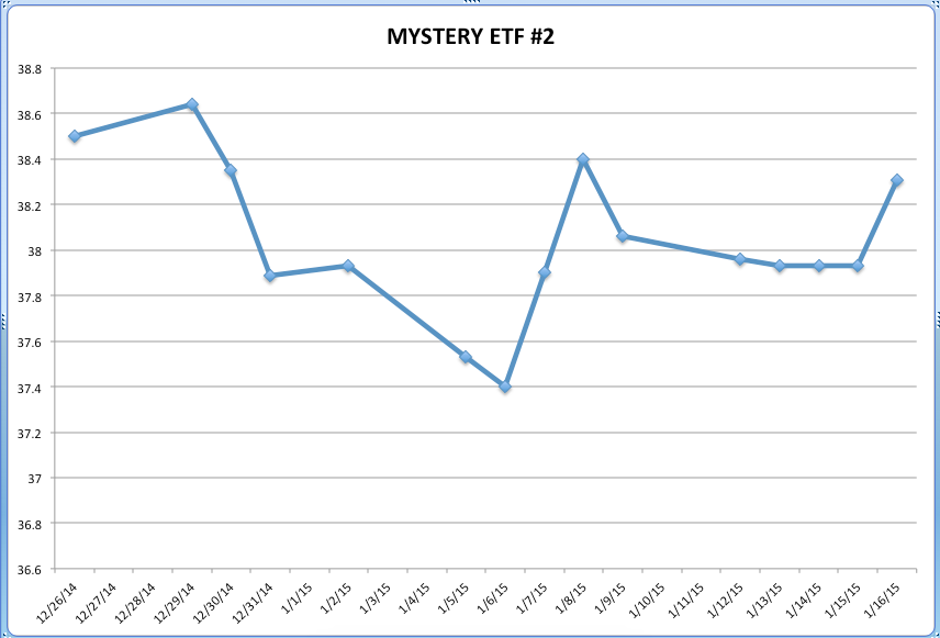
Now compare SPY with two “Mystery” ETFs during the same period:
Don’t you wish you had been invested in either ETF #1 or ETF #2 instead of SPY!!? You can find out which ETFs these “Mystery ETFs” are by looking at the footnote that follows.[6]
Why have I regaled you with all these charts? The reason is simple!
During this volatile January 12-16 trading week, I was feeling as though I was in a fast moving car that kept reversing direction in split seconds – subjecting me to whiplash! So I joked with a colleague that someone should create (and then market) a Virtual Trading Neck Brace![7]
Of course, that colleague guffawed at me[8]! However, upon further reflection I realized that there already is a virtual neck brace for investors U.S. Equities!!
“Huh?” you exclaim incredulously! “What are you talking about?”
I am talking about this:
STRATEGIC BETA (too commonly referred to as “Smart Beta”)
To oversimplify what Strategic Beta is… I liken it to plant and/or animal breeding – in which experts work to engineer a plant or animal with more of this or that characteristic and/or less of this or that characteristic.
The investment equivalent of such “breeding” is the creation of a Passive Index that contains S&P 500 Index stocks… but emphasizes one or more characteristics of S&P 500 Index stocks to a degree that leads to an investment that is quite different than the Index itself!
For example, here are a few different varieties of a “factor altered” S&P 500 Index investment vehicle:
Equal Weighting (the S&P 500 Index is Market Cap Weighted)
Quality of Earnings
High Dividends
Quality of Dividends
Size and Quality of Revenues
Those are all intriguing “breeds” of U.S. Equities, some of which we may explore in the future. However, the “breed” upon which I want to focus here is (obviously):
LOW VOLATILITY (LOW VOL)
There are a burgeoning number of “Low Vol” ETFs coming into existence, but the two biggest (most liquid) U.S. Equity Low Vol ETFs are:
PowerShares S&P 500 Low Volatility Portfolio (SPLV)
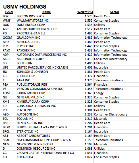
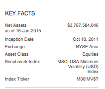
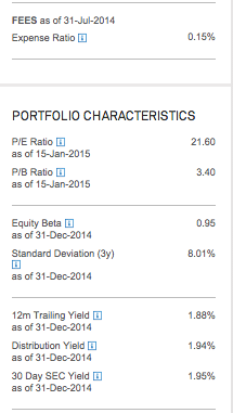
iShares MSCI USA Minimum Volatility ETF (USMV)
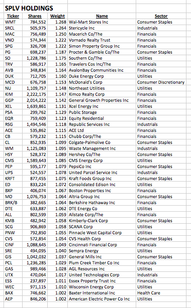
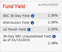
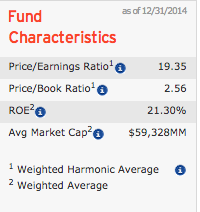
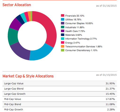
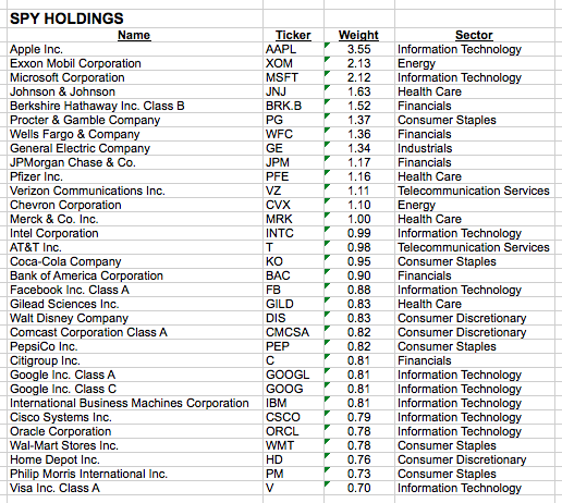
I know some of you are “detail” people, while others prefer to just (quickly) get to the bottom line. In an effort to provide for both types of readers, I have provided a substantial number of slides at the end of this article (in the Appendix) – enough to satiate the interest of most of the “detail” readers, while not holding up the “bottom line” folks.
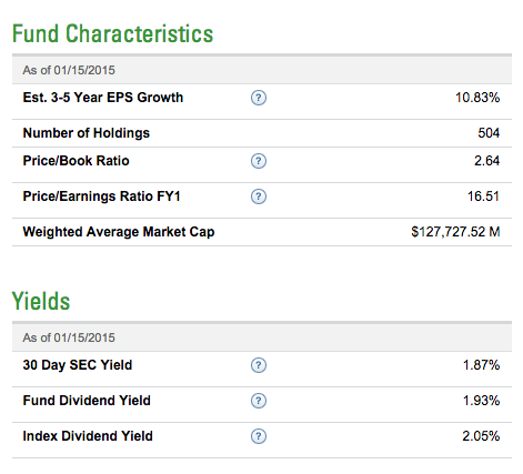
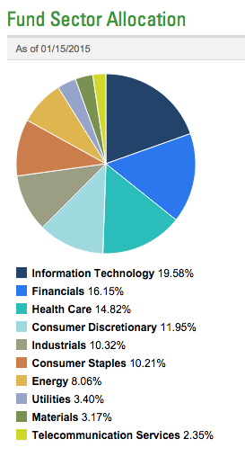
For the moment, let’s highlight the chief differences among SPLV, USMV, and the SPDR S&P 500 ETF (SPY):
|
SPY |
SPLV |
USMV |
|
| ASSETS | $ 216 Billion | $ 5.4 Billion | $ 3.8 Billion |
| # HOLDINGS | 502 | 99 | 157 |
| P/E Ratio | 16.51 | 19.35 | 21.6 |
| YIELD (SEC) | 1.87% | 2.36% | 1.95% |
| ANNUAL FEE | 0.09% | 0.25% | 0.15% |
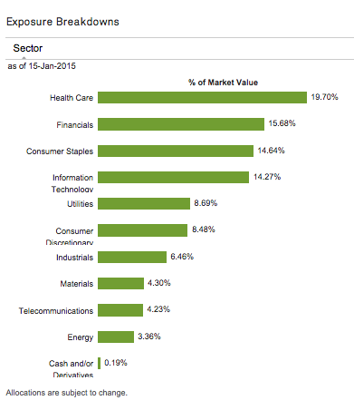
| BIGGEST SECTOR | Info Tech 19.58% | Financials 33.1% | Health Care 19.7% |
| INCEPTION | January 1993 | May 2011 | Oct 2011 |
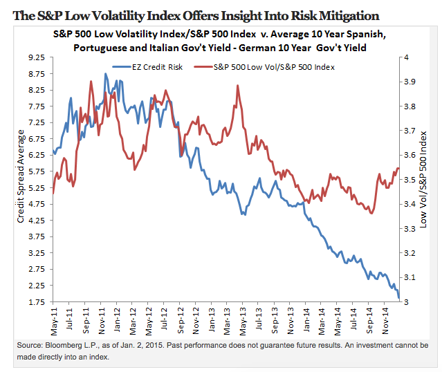
These low volatility funds have already established their mettle during times of crisis. Consider the Greek Crisis in 2011. SPLV debuted in May of that year and outperformed the S&P 500 Index during the rest of 2011, as investors sought less volatility. The counterpoint to that point, of course, is that during 2013, when investors were willing to move back into Europe, the SPLV underperformed the S&P.
This chart[9] contrasts a Ratio of Key 10-Year European Government Bond Yields[10] (the chart identifies it as “EZ Credit Risk”) with a Ratio of the Performance of SPLV vis-à-vis the S&P 500 Index:
As you can see, 2011 saw SPLV outperforming the S&P 500 Index (the red line moves upward as that blue line moves higher (signifying ballooning yields in riskier Euro Zone government bonds))… but during 2013 (a period of “risk on”) SPLV performance lagged that of the S&P 500 Index.
SPLV is “bred” by identifying the 100 least volatile stocks within the S&P 500 Index – and then weighting those stocks relative to the inverse of their volatility. In other words, SPLV gives greater weight to the least volatile of these stocks! The result is that investors can take a position in a diversified basket of U.S. Equities that will tend to move higher as U.S. stocks move higher… but will not move with the same amplitude as the S&P 500, either upward or downward.
As Craig Lazzara at Morningstar has observed (I paraphrase):
If you are an investor who gets upset when the S&P Index is up 30% while your portfolio is only up 20%… a low vol ETF is not for you!
But if you are an investor with bitter memories of the decade between 2000 and 2010, low vol ETFs will help you invest with less anxiety.
Over time, a low vol ETF can produce an excess return vis-à-vis the S&P 500 Index.
And here we have Lazzara’s own words:
“The reason it produces excess returns over time – or one of the reasons – is it truncates the downside. The price for truncating the downside is truncating the upside.”
Another feature of SPLV is that it pays out a monthly dividend (most ETFs pay quarterly, if at all). Obviously, this ETF has drawn great investor interest – adding almost $1 billion of new assets during the past year (growing fund assets by over 20%).
The iShares low vol ETF (USMV) is “bred” a bit differently than SPLV… as you saw in our “Comparison Table” earlier[11]. The creators of the index upon which USMV is based evaluate the volatility of each U.S. stock considered, as well as correlations between these stocks. The intent of that evaluation is to design a portfolio that minimizes volatility/risk in as many ways as possible. The final touches involved in this portfolio creation process include applying proprietary constraints to ensure sufficient diversification.[12]
The central key in discerning the value of a low volatility fund is “Risk Adjusted Performance”… that is, finding the optimum balance between “Risk” and “Return”.
Classic economic theory suggests that (over time and on average) an investor’s “Return” should vary in proportion to the “Risk” taken. However, history has demonstrated that this theory does not always hold true! Experts have discovered a “Low Volatility Anomaly”. In other words, they have discovered that (contrary to Econ 101) lower volatility stocks can, in fact, generate higher risk-adjusted returns than those generated by high volatility stocks!
How can this premise be measured? Consider these points;
1) Volatility is a measure of the fluctuation within the price of a security (or a portfolio)
2) Standard Deviation measures the volatility of a stock (or portfolio)… identifying the degree to which its return varies from the average or expected return. If this measure (“Standard Deviation”) is higher … that stock (or portfolio) is more volatile, and therefore riskier, than a stock (or portfolio) with a lower measure.
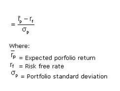
3) Sharpe Ratio
This is the key to measuring “Low Vol” funds. The Sharpe Ratio was developed by William F. Sharpe (a Noble Prize recipient).
The ratio subtracts the risk-free rate (10-year US Treasury Note Yield) from the rate of return for a portfolio … then divides the result by the standard deviation of that portfolio.
If you didn’t understand a word of the above… here is the only “takeaway” you really need (straight from Investopedia.com):
“The Sharpe ratio tells us whether a portfolio's returns are due to smart investment decisions or a result of excess risk. Although one portfolio or fund can reap higher returns than its peers, it is only a good investment if those higher returns do not come with too much additional risk.
“The greater a portfolio's Sharpe ratio, the better its risk-adjusted performance has been. A negative Sharpe ratio indicates that a risk-less asset would perform better than the security being analyzed.”
INVESTOR TAKEAWAY:
I hope you learned a few new things about investing, volatility, and the importance of balancing Return and Risk. I also hope you have become convinced that “Low Volatility” ETFs deserve serious consideration within your overall investment or financial plan!
In this regard, and tying together what we have covered above. I can assure you that the Sharpe Ratio of SPLV is higher than SPY. But why would you trust me unless I offer convincing evidence?
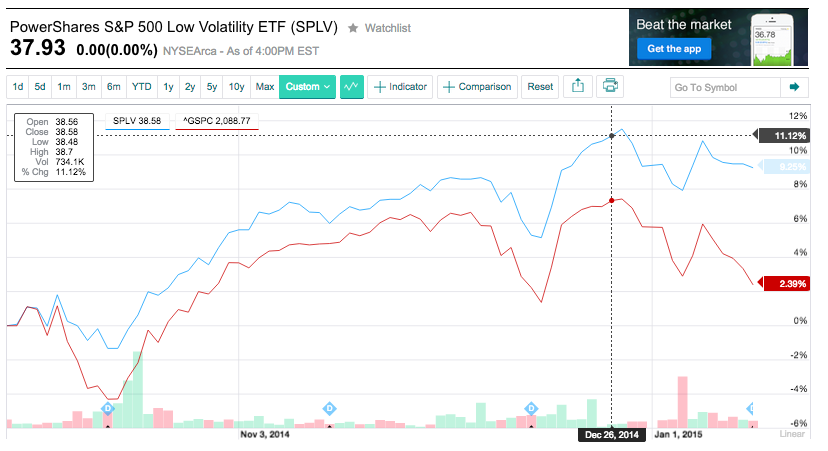
Remember October of 2014? Was mid-October volatile enough for you? This graph starts 10-1-14 and ends this past week (Jan 15). SPLV is blue; the S&P 500 Index is red.
So now you think: “Hmmm. Interesting. But how did SPLV do for the entire year?”
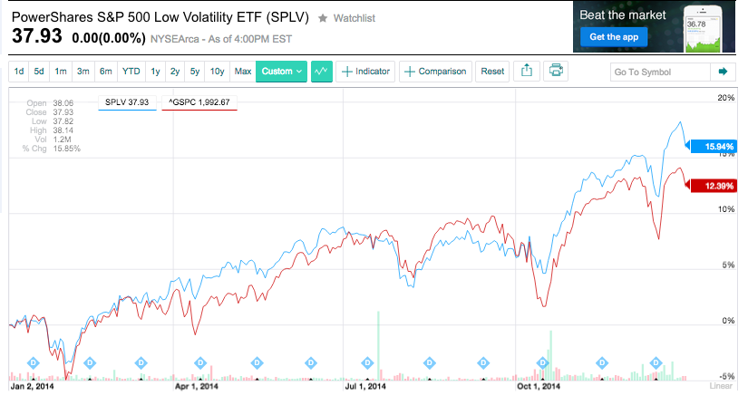
Here you go… from January 1 to December 31, 2014:
And now you think: “OK. But how did USMV do relative to SPLV?”
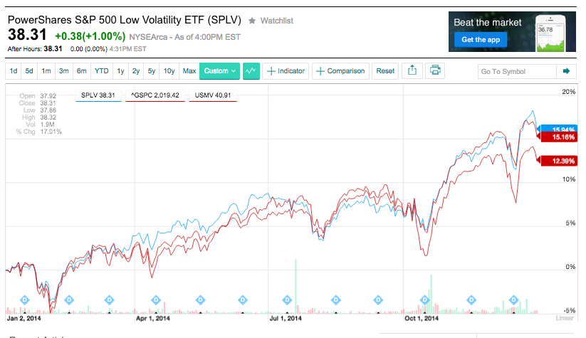
No problem! Here it is (USMV is in a lighter red than the S&P 500… it is the line that ends up in 2nd place for the year):
Because it is hard to read, here are the respective 12-month returns:
SPLV 15.94%
USMV 15.16%
S&P 500 Index 12.39%
Do you have any doubt now?
Three final notes:
1) Both SPLV and USMV do have options available. However, the bid/ask spread (although not quite as wide as a Mack Truck) are wider than we at Market Tamer prefer.
2) A “Low Vol” ETF will reduce investment loss during a volatile decline… but they will not (in any way) prevent investment loss. Even “Low Vol” fund would have taken a beating during 2007-09. The key point is that it would have been LESS of a beating!
3) Compass EMP Funds just introduced an intriguingly different “breed” of low volatility fund in 2014. I’ll keep my eye on it for a future article!
DISCLOSURE: The author does not currently have a position in either SPLV or USMV, but has an order in place to buy the former. He does have option positions in SPY.
APPENDIX:
FOOTNOTES:
[1] The volatility, as we all know, accentuated, amplified, and magnified by “Program Trading” and “High Frequency Trading”. The former is older and better known. Investopedia.com offers this definition of the latter: “High Frequency Trading (HFT) firms make money – and lots of it – by exploiting inefficiencies in the pricing of shares quoted on several exchanges in an increasingly fragmented marketplace. They also generate significant income by capturing rebates offered by various exchanges for providing liquidity.”
[2] You can find the streaming video at Bob’s website: http://explosiveoptions.net/2015/01/global-market-analysis-bloomberg-joanna-ossinger/
[3] The bank (after many public, official, authoritative reaffirmations of its long-standing “cap” of the Swiss Franc versus the Euro (essentially “pegging” the Franc to the Euro) … suddenly declared that this “cap” would no longer be honored. To use a vernacular, this resulted in “all hell breaking loose”. One top Citigroup (C) executive described that action as triggering a time of “Volatile Volatility”. That refers to trader jargon for a series of sharp, disorienting moves in stocks, currencies and bonds that can ultimately lead to market-rattling events (such as the collapse of a big bank, hedge fund, etc.). Demonstrating that truth, currency firm FXCM almost went bankrupt… and the trading desk at Citigroup lost more than $150 million.
[4] Euro Futures moved from over 1.20 down to almost 1.1925,,, a big move on a Sunday open
[5] If any of you think I am unnecessarily suspicious… I draw to your attention the Libor Price Fixing Scandal (sometimes called “Lie bor”) and the Barclay’s Gold Price Fixing Scandal.
[6] Mystery ETF #1 is iShares Barclays 20+ Years Treasury Bond ETF (TLT)
Mystery ETF #2 is PowerShares S&P 500 Low Volatility Portfolio (SPLV
[7] Case in point: on Tuesday (Jan 13) the Dow Industrial Index had a price swing of 425 points (or 2.4% from the prior day's close)!! That put that day in the top 100 volatile days since the market bottomed on March 9, 2009.
[8] He already thinks me “certifiable”… so this idea only bolstered his diagbosis.
[9] The chart can be found at the Invesco site: http://www.blog.invesco.us.com/greek-election-low-volatility-weathering-eurozone-uncertainty
[10] [The Ave of Portugal, Spain, Italian 10 Year Gov’t Bond Yields divided by the 10 Year German Bond Yield]… the higher that ratio moves, the greater the degree of perceived financial RISK in the European Zone (Euro Zone).
[11] You can see stark contrasts between USMV and SPLV in the Appendix.
[12] YahooFinance.com describes USMV portfolio creation this way: The underlying index follows a rules-based methodology to determine weights for securities in the index that seeks to minimize total risk of the MSCI USA Index. Components primarily include consumer staples, healthcare and information technology companies.
Related Posts
Also on Market Tamer…
Follow Us on Facebook


 Why LVMH Moët Hennessy-Louis Vuitton Stock Was Getting Crushed Again on Tuesday

