Our regular readers know that one of my most consistently proffered investment suggestions has been: Divesification! In fact, I refer to the central importance of Diversification… and its “cousins” (Asset Allocation and the Efficient Frontier)
so frequently that some readers might characterize me as having one major mantra:[1] “Diversification! Diversification! Diversification!”
As I have explained countless times before, the value of a sound Asset Allocation program designed to ensure that a portfolio is effectively Diversified to optimize the “Risk/Reward” profile of that portfolio cannot be overstated [See: https://www.markettamer.com/blog/sharpen-your-analysis-of-ibb-xbi-and-fbt; https://www.markettamer.com/blog/key-information-ratio-for-deciding-between-fcntx-and-rgaax ].
Well, friends, if confession is good for the soul, then my soul is going to feel mighty good as you read what appears just a few sentences further down!
I ask you to recall the infamous “Disclaimer” that appears at the start of virtually every market educator’s video commentary. To grotesquely paraphrase and oversimplify said “Disclaimer”… the essence of it is as follows:
1) Past performance is no guarantee of future success;
2) This commentary is not intended to offer any investment recommendation;
3) Trading is very risky, and you could lose your shirt (your blouse, your skirt, your pants, your heavily financed car, and/or even a friend or two)[2];
My confession runs along the same line as the above Disclaimer:
1) Past Performance sure was no guarantee of comparable results during 2015!
2) Remember that I never “recommended” Diversification or Asset Allocation… your financial adviser must have done so… si blame her/him!!
3) The year 2015 reminded us just how “Risky” trading can be (as we experienced on August 24th: “Black Monday”). But hopefully you didn’t lose your “shirt”… maybe just a T-Shirt or a pair of socks!
With regard to Asset Allocation and Diversification, data compiled by Bianco Research LLC and Bloomberg (their data was released three days before the close of trading in December of 2015), the year 2015 was the worst year for Asset Allocation since 1937!
Wow! 1937! Contrary to the supposition of some folks who think I seem to be “ancient”… I wasn’t around that long ago! 79 years is a long, long time!
Why is this so noteworthy? In classic investment textbooks, the Asset Allocation chapter describes in detail the central reason that Asset Allocation is essential within an effective investment plan:
1) The age-old “standard” asset classes have been:
a) Cash
b) Fixed Income
c) Equities
d) Gold/Precious Metals/Commodities
2) Studies show that, over time, equities produce a higher return than the other asset classes. So without any further information, one might think the best long-term strategy would be to invest 100% in a low-cost S&P 500 Index ETF.
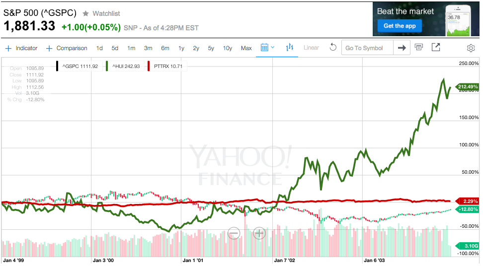
a) So, let’s check how that strategy would have done from 1/1/1999 through 12/31/2003 (none of the returns reflect dividends; just index/fund price movement!)
1/1/1999 to 12/31/2003
S&P 500 Index (^GSPC) – 12.80%
Pimco Total Return Fund (PTTRX) + 2.29%
Gold Bugs Index (HUI) + 212.49%
“Oooops!” Your 100% equities portfolio would be down by almost 13%, while your “gold bug” neighbor to the south (Ron) would find his portfolio up by over 212% … and your quieter neighbor to the north (Terry) who invested in bonds would be up an extremely steady 2.3%.
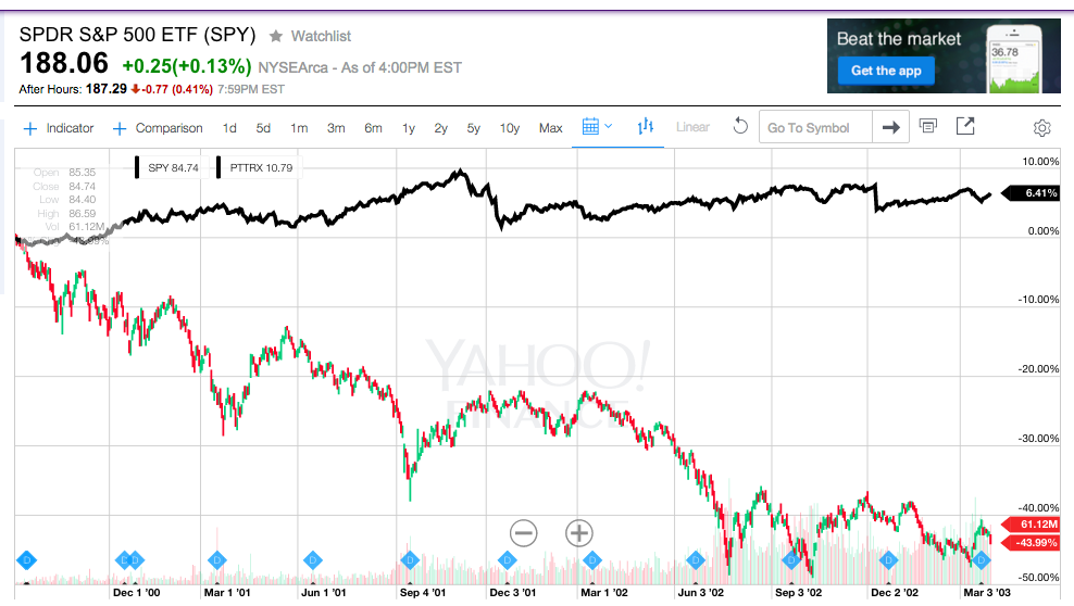
To help you visualize the detail within the stock and bond asset categories during this period (hidden because the scale of the graph was skewed highly upward by the price of gold), here is the relative performance of the S&P 500 (through SPY) and PTTRX from 9/1/2000 and 3/30/2003.
9 1 2000 3 30 2003
S&P 500 Index ETF (SPY) – 43.99%
Pimco Total Return Fund (PTTRX) + 6.41%
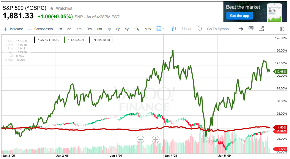
b) How about between 1/1/2005 through 12/31/2009 (none of these returns reflect dividends; just index/fund price movement!)
1 1 2005 to 12 31 2009
“Ooooops, again!”
S&P 500 Index (^GSPC) – 5.99%
Pimco Total Return Fund (PTTRX) + 1.50%
Gold Bugs Index (HUI) + 112.48%
You would be down again!!… this time by almost 6%, while your “gold bug” neighbor to the south would be up by over 112% … while Terry (the bond lover) to the north would be up an extremely steady 1.5%.
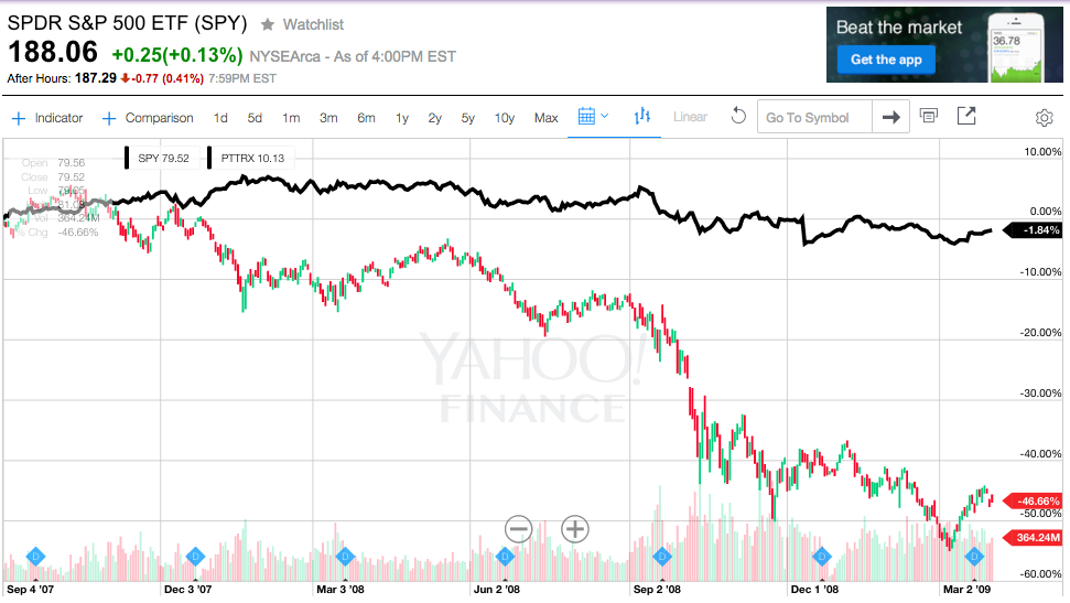
Once again, to help you view the detail within the stock and bond categories during this period (obscured by the huge jump in gold), here is the relative performance of the S&P 500 (through SPY) and PTTRX from 9/1/2007 and 3/30/2009.
09 01 2007 to 03 31 2009
SPY – 46.66%
PTTRX – 1.84%
Terry may not be a happy investor, but he feels infinitely better about his portfolio than you do!
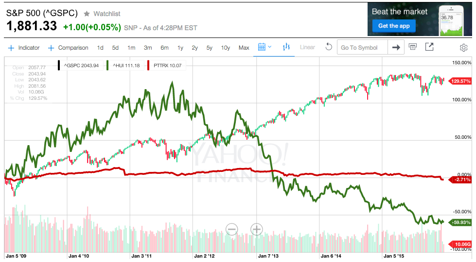
c) Finally, how about between 1/1/2009 through 12/31/2015 (none of the returns reflect dividends; just index/fund price movement!)
1/1/2009 to 12/31/2015
S&P 500 Index (^GSPC) + 129.57%
Pimco Total Return Fund (PTTRX) – 2.71%
Gold Bugs Index (HUI) – 59.93%
Finally! You outperformed the gold bug to the south[3] … and you know you far outperformed “steady-Eddie” Terry!! Congratulations!
So what would a good solution have been to these wild gyrations in the movements of prices in these asset classes?
Absolutely! Asset Allocation – an optimized mix of each of these assets [plus the “riskless” asset class – U.S. Treasury Bills (which I did not include in the above analysis in order to keep the graphs less cluttered)] would have smoothed out the annual returns from your portfolio and helped you sleep much better at night!! Since each of these asset classes provide an investor with distinct “Risk/Return” characteristics, the blended group of assets would also have improved the relative return you received for the risks you took… [the Efficient Frontier].
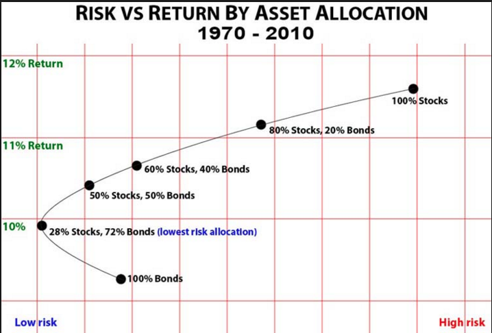
Here is just one example of a helpful "Efficient Frontier" graph. Note that the allocation with the "lowest risk" was 72% and 28% bonds.
As I wrote this, it occurred to me that an exceptionally effective way of illustrating the principles of Diversification and Asset Allocation is to liken them to “Contrapuntal Music”. However, I recognize that while this analogy will be of great interest to many readers (perhaps even exciting) it will most assuredly leave many readers cold. So I have included my description of this analogy in the APPENDIX section following this article.
Let’s get back to the startling results reported in the 2015 performance report from Bianco Research and Bloomberg… ie. Asset Allocation had its worst year since 1937. That is startling enough, but now consider these data points:
1) In a “normal” year, an investor could find constructive “refuge” in at least two or three asset classes that would serve to balance out losses in stocks. However, during 2015, “refuge” asset classes were few and far between:
a) There were 252 trading days during the year
i) According to the Wall Street Journal, the closing price of the S&P 500 and Nymex Crude Oil “both closed down on 87 out of [those] 252 trading sessions… That’s the most in any year since at least 1984.”
b) If investors tried to find “refuge” in bonds, there wasn’t much yield to be had there… so millions of investors were tempted to move into the U.S. corporate high-yield bond market. Big mistake! The Barclays U.S. Corporate High-yield Bond Index (through December 27th) lost 4.5 percent.
c) Even if an investor went for lower yield and more safety by buying longer-dated corporate investment grade credit securities – that bond category lost 4.6 percent.
d) And for heaven’s sake readers, those who moved into securities in the relatively uninteresting intermediate-term bond space would have only eked out a small gain.
e) Since equities in the “Developed World” were not performing well, countless investors dipped a toe, a foot, or a leg into the “Emerging Markets” class [which had underperformed during the previous 4 years] in hopes that those equities had “found a bottom” and they could profit from “reversion to the mean.” Big mistake! Those equities were down by 17% during 2015.[4]
Now let’s review the Bianco/Bloomberg report a bit more systemically.
 A significant part of Bianco Research’s work focuses upon assessing the overall health of the financial markets through the continuous performance tracking of what company founder, Jim Bianco,
considers the historically key asset class groups:
1) S&P 500 Index;
2) Thirty-year U.S. Treasury bonds;
3) Three-month U.S. Treasury bills;
4) The Thomson Reuters/Core Commodity CRB Commodity Index.
As you review the following, keep in mind that, including dividend distributions, the S&P 500 Index was up about 2.2% for the year… while without dividends, the Index declined fractionally. Cash was up much, much less than the total return of the S&P 500 Index (and in Europe, with “negative interest rates”, many cash holders actually lost money). Bonds and commodities showed losses.
One important note about PowerShares QQQ Trust, Series 1 (QQQ) in the graph and table below. As most of you know, the eye-catching outperformance of QQQ during 2015 was driven primarily by just four stocks… the so-called “FANG” stocks. That anomaly, while very profitable during 2015, was also much riskier on a “Relative Return/Risk” basis. Here is the quarter-by-quarter performance during 2015 of “FANG” versus the S&P 500 Index:
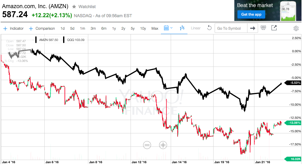
During the first 20 days of this month (January), QQQ (down 5.53%) far outperformed highflyer Amazon (AMZN )(down over 13%):
That illustrates just one of the downsides of playing “highflyers”.
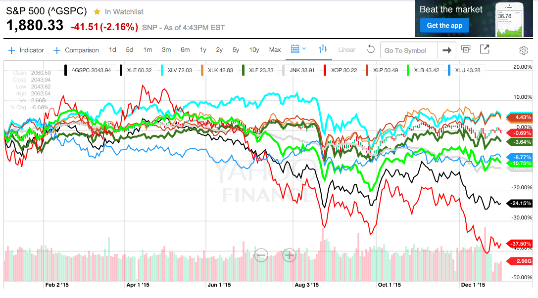
In the graphs below (created through YahooFinance.com), please note that performance does not reflect either dividends or interest.
| Name | Ticker | 2015 Return |
| PowerShares QQQ Trust, Series 1 (ETF) | QQQ | + 8.67% |
| S&P 500 Index | ^GSPC | – 0.69% |
| iShares Core U.S. Aggregate Bond ETF | AGG | – 2.19% |
| Vanguard FTSE Developed Mkts ETF | VEA | – 2.57% |
| Vanguard FTSE Europe ETF | VGK | – 4.33% |
| iShares 20+ Year Treasury Bond ETF | TLT | – 5.29% |
| iShares Russell 2000 Index | IWM | – 5.31% |
| Vanguard Emerging Markets Stock Index Fd | VWO | – 17.32% |
As a brief aside, when I researched the best U.S. Treasury “Long Bond” to use in the above table, I looked at both the iShares 20+ Year Treasury Bond ETF (TLT) and the SPDR Barclays Long Term Treasury ETF. When I compared the relative maturities contained within their respective portfolios, I was (mildly) surprised that TLT contains a higher percentage of bonds between 20-30 years in maturity!!!
SPDR Barclays Long Term Treasury ETF (TLO) vs TLT
Moving on to relative performance with equity sectors, here is a chart of most of the most popular U.S. sector ETFs:
|
Name |
Ticker |
2015 Return |
| SPDR S&P 500 ETF | SPY | + 0.76% |
| Health Care Select Sector SPDR® Fund | HLV | + 4.95% |
| Consumer Staples Select Sector SPDR Fund | XLP | + 4.43% |
| Technology Select Sector SPDR Fund | XLK | + 3.78% |
| Finance Select Sector SPDR Fund | XLF“ | – 3.64% |
| Utilities Select Sector SPDR Fund | XLU | – 8.77% |
| Materials Select Sector SPDR Fund | XLB | – 10.75% |
| SPDR Barclays High Yield Bond ETF (JNK) | JNK | – 12.33% |
| Energy Select Sector SPDR Fund | XLE | – 24.15% |
| SPDR S&P Oil & Gas Explor & Prodtn ETF | XOP | – 37.50% |
Although I did not prepare a graph, here are a few additional “Sector ETFs”:
|
Name |
Ticker |
2015 Return |
| Consumer Discretionary Select Sector SPDR Fd | XLY | + 9.12% |
| Real Estate Select Sector SPDR Fund | XLRE | + 3.22% |
| Financial Services Select Sector SPDR Fund | XLFS | + 2.73% |
| Industrial Select Sector SPDR ETF | XLI | – 6.19%% |
Because of the aberrant behavior of the markets during 2015 (compared to the “Normal” year), investors were not only unable to secure any real “smoothing” effect from diversification, … but they really didn’t have a good place (besides cash) to dependably invest money for a “fair return”.[5]
That contrasts sharply with investment history since 1995… when almost every year provided at least one asset class that offered investors a return in excess of 10%. Amplifying the unusual nature of 2015 are these data points:
1) Over the past 90 years, 25% of those years included at least one asset class that returned more than 30%
2) And over the same 90 years, only four of those years failed to offer at least one asset class with a gain of at least 4%!!
Numerous experts have “weighed in” on this anomalous investment year just place… including Hayes Miller,
the head of North American Asset Allocation at Baring Asset Management LLC:
“It’s been challenging from the point of view that the equity market and bond market are probably more joined at the hip than normal…. We’ve had high cash exposure relative to norm because we felt cash provides one of the only good diversifiers against the risk-off trade.”
Jim Bianco echoed this reference to the unusual (and dysfunctional) correlation of investment returns during 2015 (which greatly reduces any expected benefit from diversification):
“While the depth of losses in equities and commodities is nowhere near as bad as in 2008, the correlation of declines highlights the challenge for money managers who seek to amplify returns by rotating among assets. Among other things it’s a recipe for pain among hedge funds”.
Bianco went on to offer this observation regarding the outsized impact of the U.S. Federal Reserve[6] on the markets:
“The Fed stimulus lifted all boats, and then the Fed withdrawing the stimulus is holding the boats down…. If the argument is right that the economy is going into 2016 weak and earnings are negative, those conditions will continue and therefore on the asset allocation level, I don’t expect anything to break out just yet.”
In fact, in late December data from Bloomberg and Hedge Fund Research indicated that the hedge fund space was heading for its worst annual performance since 2011… including closure of a number of hedge funds!
With regard to hedge funds, my personal opinion is that David Einhorn is one of the more dependable and reliable hedge fund managers in today’s market.[7]
Therefore, because billionaire investor Einhorn had a really bad year in 2015, that is just one additional sign of a very challenging (and unusual) market environment!
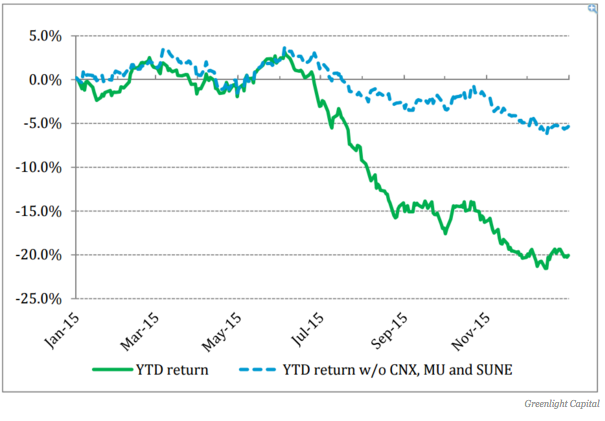
Mr. Einhorn manages the Greenlight Capital hedge fund. During 2015, Greenlight’s portfolio lost over 20% of its value![8] To show how startling that is, consider that Einhorn's only previous down year was in 2008[9],when his fund lost 23%.
In particular, Einhorn’s fund was seriously crippled by just three individual stocks:
CONSOL Energy Inc. (CNX) – collapsed more than 75% in 2015;
Micron Technology, Inc. (MU) – fell almost 60%;
Sunedison Inc (SUNE) – got crushed by 74% during 2015.
In Einhorn’s most recent communication with shareholders, he apologized and offered an extended breakdown of “why” the fund performed so poorly. Especially helpful was the following graph, which contrasts the 2015 performance of the fund vis-à-vis what the performance would have been had it not owned those three “cratering” stocks (ie. it would have been down just 5%!).
Einhorn wrote: “We have never had a year where so little went right,” And his year went so badly that one of his children played the role of “adviser” and told his father:
“Dad, why don't you just short your longs and long your shorts?”
As Einhorn went on to observe in his shareholder communication:
“These aren't our first big losses nor are they likely to be our last, and while our goal is to minimize them, they come with the territory of running a concentrated portfolio.”
Obviously, as our readers already recognize, when the “Markets” are acting badly, the rapidly growing universe of ETFs also suffer weak performance! According to data from Bloomberg, among the 35 ETFs it tracks, the median loss for 2015 was about 5 percent.
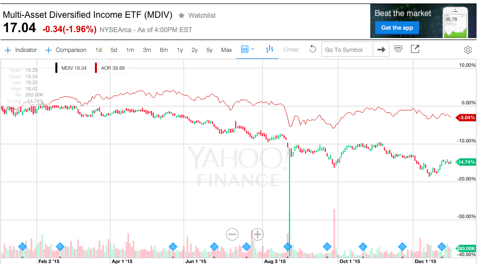
Amplifying the basic theme of this article, even the ETF space that focuses upon optimizing “Asset Allocation” failed to deliver upon their expected outperformance. For example, consider:
1) The iShares Core Growth Allocation ETF (AOR), which carries a mix of 60 percent in stocks and 40 percent in bonds. During 2015 (including dividend and gain distributions) it slipped about 0.5 percent;
2) The First Trust Multi-Asset Diversified Income Index Fund (MDIV) suffered even a weaker performance — down about 7.4 percent (also including distributions).
The chart below shows the 2015 performance of these two ETFs. This chart (once again) does not account for dividends/interest … and shows that AOP was down 3.04% on the year, while MDIV fell 14.74%… a very rough year, indeed!
Commenting on the difficulty within the multi-asset allocation space, the head of BMO Global Asset Management’s multi-asset strategies operation, Lowell Yura, offered this investor caution:
“Investor expectations for both equities and bonds have been elevated by recent history. This year is a wake-up call to think about lower returns for the next several years.”
By now we are very clear that the S&P 500 Index went “nowhere” during 2015. Outside the U.S., equities fared even worse in dollar terms … with the MSCI EAFE Index dropping 3.1 percent while the MSCI Emerging Markets Index sank 16 percent.
Moving on to “Commodities”… they fell to their lowest point in over ten years. This was due to a convergence of factors– including
1) Nearly non-existent inflation within developed economies;
2) Weakening demand from China (formerly a major driver of commodity prices to the upside);
3) Very volatile, unpredictable, and even capricious price action within the Chinese equity markets;[10]
4) Chinese financial authorities (from “out of the blue”) engineering a devaluation of the Yuan; and
5) A spectacular glut of oil around the world (just the amount of oil “parked” in tankers around the earth boggles the mind).
[See: https://www.markettamer.com/blog/a-free-market-or-macau-with-margin-part-I;
https://www.markettamer.com/blog/a-free-market-or-macau-with-margin-part-ii ]
Illustrating the “carnage” within commodities, here are 2015 results from a number of key ETFs within that space:[11]

Holders of GLD during 2015 may have been disappointed by the return. But GLD clearly outperformed countless other commodity investments!
|
Name |
Ticker |
Return |
| SPDR Gold Shares ETF | GLD | – 11.06% |
| United States Commodity Index Fund | USCI | – 15.90% |
| Wisdom Tree Continuous Commodity Index Fund | GCC | – 18.49% |
| Elements Rogers Intl Commodity ETN | RJI | – 26.04% |
| PowerShares DB Commodity Index Tracking Fund | DBC | – 26.71% |
| iPath Bloomberg Commodity Index Trust ETN | DJP | – 27.99% |
| iShares S&P GSGI Commodity-Indexed Trust Fd. | GSG | – 32.94% |
Finally, within the fixed income space, high-yield corporate debt suffered its first annual decline since 2008. This horrible performance was also due to a convergence of factors… primarily including:
1) the collapse of oil prices (approximately one-fifth of aggregate junk bond securities are tied to the oil/energy space); and
2) fears that rising interest rates will accelerate potential corporate bankruptcies (very negative for bondholders, obviously).
INVESTOR TAKEAWAY:
So Asset Allocation failed to work its investment “magic”” (the Efficient Frontier” effect, etc.) during 2015!
What does this mean for you and me as investors? Have the basic principles underlying these concepts, such as:
Risk-Adjusted Return
Relative Risk
Sharpe Ratio
CAPE Ratio
Diversification
Efficient Frontier
suddenly become inoperative, extinct, and/or irrelevant?
Absolutely not!!
The year 2015 merely serves to remind us that investment markets are dynamic systems… constantly in motion instead of being linear, orderly, tidy, and dependable!![12] During 2015, the various asset classes exhibited a high degree of “correlation” (meaning the variability among their various returns were not as high as normal[13] That in no way suggests that such high correlation should be expected to continue into the future!
Let’s review what many observers call “the Lost Decade” – between 2000 and 2010:
|
INVESTMENT ASSET |
Avg. Annualized Return |
| S&P 500 Index (including dividends) | + 1.4% |
| Russell 2000 Index | + 6.3% |
| MSCI Emerging Markets Index | + 16.2% |
| BALANCED Portfolio (60% Stock/40% Bonds)[14] | + 7.83% |
Perhaps you agree with me that a lot of investors would have loved a gain of 7.83% during 2015!!
There is one quite variable aspect of Asset Allocation that might have helped investors during 2015 – how often the portfolio was rebalanced. In past articles, we have touched briefly upon different perspectives upon that “frequency” question. To put it simply, “all other things being equal”, more frequent rebalancing should (in principle) improve the Reward/Risk profile of a portfolio.
However, “all other things are not equal”!! Transaction costs can negate the positive impact of rebalancing. So each investor and/or portfolio manager must discern what the best policy for rebalancing is for their particular situation.
That being said, it is very fair to say that rebalancing two to four times a year (on a systematic, disciplined basis) is much better than rebalancing haphazardly, or (worse) “when I get around to it”! The very act of rebalancing forces the investor to do that for which we all strive… but which, as we actually do it, is often emotionally difficult:
“Sell High” [such as when tech stocks were performing “lights out” in 2000]
“Buy Low” [such as in March of 2009 when the stock market had cratered and no one knew where it would stop]
DISCLOSURE:
The author holds positions in any number of ETFs referred to above, including SPDR Gold Trust (GLD), SPDR S&P 500 ETF (SPY), iShares 20+ Year Treasury Bond ETF (TLT), iShares Russell 2000 Index (IWM), Vanguard Emerging Markets Stock Index Fund (VWO). The author is also a lifelong fan of Johann Sebastian Bach… but is also a lifelong fan of music ranging from Joni Mitchell and Dan Fogelberg to Led Zeppelin, the Eagles, and the Rolling Stones. Nothing in this article is intended as a recommendation to buy or sell anything. Always consult with your financial advisor regarding changes in your portfolio – either subtractions or additions.
APPENDIX:
CONTRAPUNTAL MUSIC AS AN ANALOGY TO THE BENEFIT OF ASSET ALLOCATION
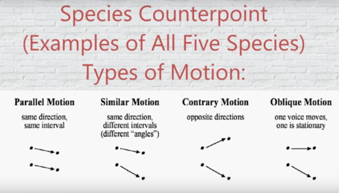
Consider these four primary types (“species”) of motion within music… which when used individually and together help us to grasp the significance (and beauty) of musical counterpoint (aka “contrapuntal music”).
[Listen/watch the following YouTube.com streaming video for a sample of each motion:
https://www.youtube.com/watch?v=xnkI2z0cFjQ&list=RD4O6lc_ym12U&index=2 ]
Hopefully, you can quickly grasp the similarity between these four types of motion and how the daily (or hourly, weekly, monthly, etc.) price action of asset classes can move relative to one another. For example,
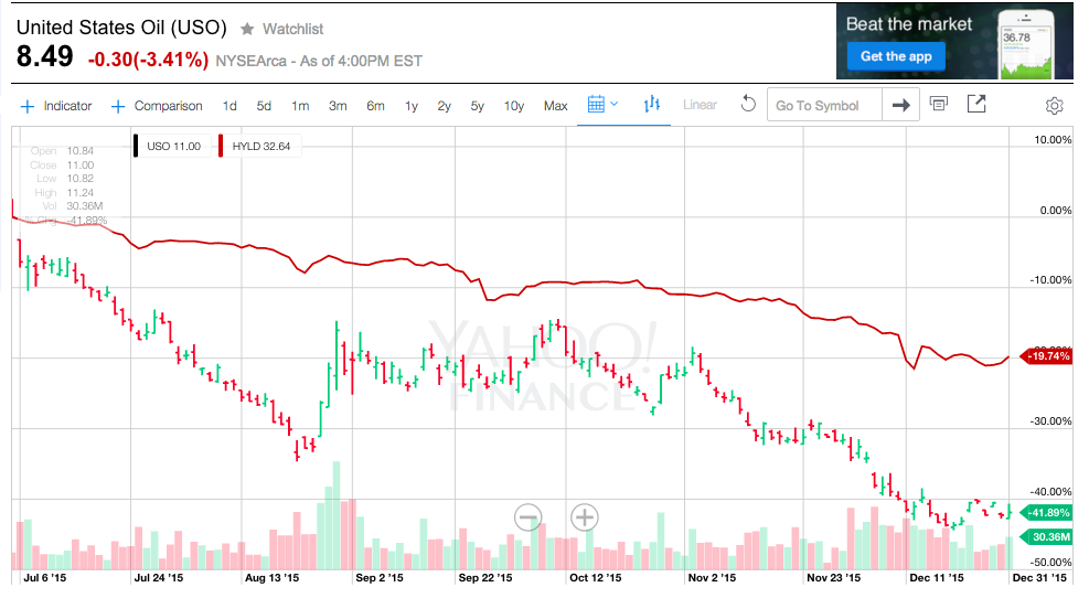
1) Parallel Motion: During the past 6 months (July through December 2015), the price of Crude Oil and High Yield Bonds have (largely) moved parallel to one another.
United States Oil (USO) -41.89%
Advisor Shares Peritus High Yield (HYLD) -19.74%
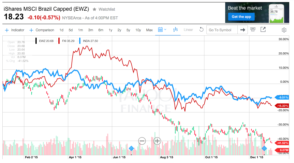
2) Similar Motion: Various equity indices within the Emerging Market space frequently reflect similar motion – during 2015, that direction was more often down than up, and iShares MSCI Brazil Capped (EWZ).
The iShares MSCI India ETF (INDA) was reasonably steady, but sloping downward, through 2015… while the iShares FTSE/Xinhua China 25 Index (FXI) and the iShares MSCI Brazil Capped ETF (EWZ) sloped even more sharply downward through much of the year. For the entire year, INDA declined just 9.51%, FXI was down 15.33%, while EWZ tanked by almost 42%!
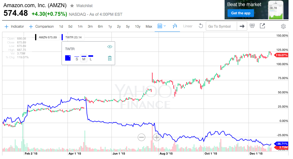
3) Contrary Motion:
Amazon (AMZN) up over 119%
Twitter (TWTR) down almost 37%
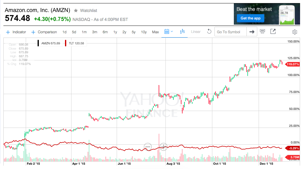
4) Oblique Motion:
This graph is not entirely a “fair” example, but visually, it does capture the point at hand. On a relative basis, AMZN moved steadily upward while TLT “marked time”
AMZN up over 119%
TLT down just 5.29%
So we have now covered (albeit superficially) the theoretical parallels between the four types of musical counterpoint and the price movements within asset classes.

Johann Sebastian Bach at the organ. His unusually wide finger spread enabled him to play some chords that the average player could not.
Now let’s put this all together into a well-known classical form of music called the “Fugue”… a musical form whose best known example is the amazing and abundant work of Johann Sebastian Bach – a true master within the “Baroque Period” of music (1600-1750). Contrapuntal music blossomed and flourished within the Baroque Period.
Watch/listen to this YouTube.com streaming video [ https://www.youtube.com/watch?v=95gLT7NzHAM&index=3&list=RD4O6lc_ym12U ]
… and imagine the movement of the various levels of notes shown in the video as representing the price action of three different asset classes on a market pricing graph.
Notice that at the beginning of the Fugue, when only one line on the sheet music is being played (similar to a portfolio with just one asset class)… the range of movement is rather wide (the sound moves around a lot).
But then observe that as the other lines of notes are added, the sound becomes fuller, richer, more interesting, and much more balanced! In fact, that is the very reason why Baroque Period music rose to popularity and has been treasured ever since.
A very similar effect occurs when an investor adds a skilled variety of other asset classes to a portfolio that already includes equities. The resulting “mix” produces smoother returns (due to lower volatility) and provides the investor’s portfolio with an improved “Reward/Risk” profile… as suggested in the Efficient Frontier graph we showed much earlier:
FOOTNOTES:
[1] I offer this in the spirit of the standard mantra offered by real estate agents: “Location, Location, Location!”
[2] In fact, you might just be left with only your dog (humankind’s best friend)…. Oh, you don’t have a dog?? Well then, I will just have to pray for you!
[3] (in fact, he has hit you up to pay his tab at the local pub once or twice!)…
[4] Three big 2015 trends became impossible for EM equities to overcome: 1) slower growth in China (and instability in its markets); 2) the steady fall of commodity prices; 3) the negative impact of a seemingly “topless” U.S. Dollar.
[5] One creative investment observer likened 2015 to Martha Vandella’s 1965 hit song: “No Where to Run, Nowhere to Hide”. Investors had “No where to hide”!!
[6] Separately, Michael Arone (chief investment strategist at State Street Global Advisors’ U.S. Intermediary Business) offered this comment– the perpetual focus during 2015 of “When will the Fed lift rates…” was a chronic (and dysfunctional) distraction for investors:
“The Fed has finally broken that cycle by beginning policy normalization, and hopefully this will provide the market some clarification and resolve in a more solid direction…. . If the market feels comfortable at the pace of which the Fed moves interest rates and the economy is recovering, risk assets like stocks could perform well.”
[7] Einhorn is not as controversial or blatantly public as Bill Ackmann or Caril Icahn… and seems to aim for less spectacular and therefore more achievable and steady) annual returns.
[8] That performance makes me look like a frickin’ genus in comparison. However, next year the law of “Reversion to the Mean” dictates that Einhorn will return to looking like a genius and I will stink in comparison!!!
[9] When the “financial world” was coming apart.
[10] I cannot help but liken the Chinese economic and market officials (who first stoked the flames of equity fever in China, and then tried to “cool” those flames in extremely inept ways) to men seemingly engaged in a high stakes version of “Pin the Tail on the Donkey”. Just this past week, the official who pushed the failed idea of 7% market “Circuit Breakers” offered to resign.
[11] If you are curious about the details of some of these ETFs, take a look at: http://www.etftrends.com/2015/12/commodity-etfs-take-beating-from-fed/
[12] Well, OK… I will grant that we can “depend upon” the “Market” to fairly regularly surprise us!
[13] Put more crudely, this “highly correlated” adjective simply means that all the returns “stank”. The exception was found within the “FANG” stocks.
[14] The 60% allocation to equities would be split appropriately among different categories of stocks.
Related Posts
Also on Market Tamer…
Follow Us on Facebook








 Why Lumen Stock Is Soaring Today

