If your July investing Profit/Loss (P&L) Chart looked anything like mine, you have my empathy. The period between July 16th and July 30th was challenging enough for anyone net long “Delta”… and then Thursday, July 31st came along: a 317 point drop in the Dow Jones Index![1]
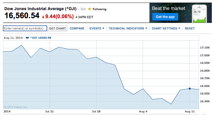
This is a graph of the Dow Jones Index between mid-July and early August of this year... showing a decided decline.
Friday’s opening on August 1st brought more of the same, with another drop of 126 points, before the market started to settle down a bit. Friday’s trading ended down just 70 points on the Dow! The most entertaining part of that Friday’s trading was the ever-amusing media listing of all the “reasons” for the drop: Portuguese bank insolvency, Ukraine confrontation, Hamas in Gaza, the Ebola virus, etc.[2]
Whenever my screen shows a big red number under the “P&L Today” column, I take my Maalox and draw some comfort from this fact – it isn’t as bad as on “Black Monday” of 1987[3]… when the Dow dropped a hefty 508 points.
Now I wouldn’t blame you if you thought to yourself: “Geez, Petty… are you a wimp! 508 points is nothing! That’s just a little over a 3% drop at the Dow’s end of July pricing!”
That is true, my friends. However, keep in mind that in 1987, a 508 point drop in the much lower Dow Index resulted in a free fall of over 22.6%.
If the Dow were to have dropped 22% from the opening price on July 31st of this year, that decline would have been 3,813 points!!![4]
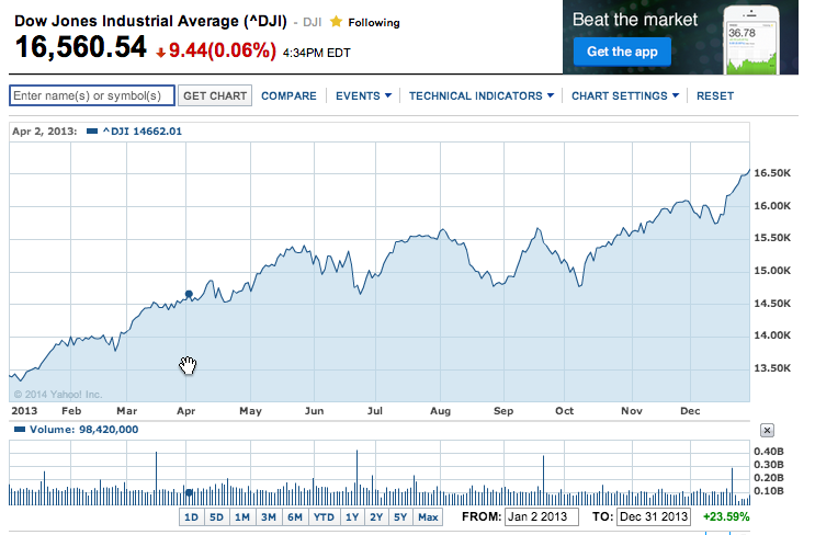
Moving from hypotheticals to actual 2014 numbers, between the high on July 16 and the most recent nadir on August 16th, the Dow declined almost 4.5%! I didn’t find that pleasant, but I (and you) have been “spoiled”!! The stock market was unusually strong during 2013. In fact, after April 1st of last year, the market never really “corrected” during the rest of 2013!
In sharp contrast, the summers of 2010, 2011, 2012 suffered from declines between 8.4% and 16.8%
If for purposes of analysis we consider a “Correction” to be a decline of 10% or more… the most recent time period during which we came close to such a decline was between April and June of 2012… when the Dow (based on closing price) was off by almost 9% (between April 1 and June 4); while the S&P 500 declined by 9.94% (between April 2 and June 1)! [We’ll come back to these figures a bit later.]
Why do I bring all of this to your attention? I have been doing a lot of reading lately on “Smart Beta” Investing! I assure you that “Smart Beta” is currently one of the hottest trends within the ETF investing space! In addition, I can assure you that this topic is (simultaneously) one of the most confusing and overly complicated topics currently prevalent within investing literature.
Let me offer a simple example that I hope will bring a sardonic smile to your face. At a 2012 Morningstar Conference[5], Shannon Zimmerman (Associate Director of Fund Analysis at Morningstar) offered a lingo-laced “lead in” on a question directed to one of the panelist. I thought the panelist parried the question perfectly:
Zimmerman: “So the downside capture ratio, just to stick with the metrics, is superior on the low volatility side, but R-squared between the low volatility strategy and some of the value indices that S&P offers would be relatively high?” [Are you thinking: “Huh?”]
Lazzara: “A better way to think of it is just to look at tracking error relative to vanilla — vanilla being the S&P 500, of course, in this context. The tracking error of, let's say, S&P 500 Value versus S&P 500 is … maybe about 3% to 4% range, because it has a lot of stock and it's cap weighted.
“The tracking error of S&P 500 Low Vol versus S&P 500 is on the order of 10%. It's a big tracking error. As the technologists say, that's not a bug, that's a feature.”
My friends, if you ignore the “jargon” above and focus on the substance, you have caught on to an essential element of “Smart Beta”!!
“Smart Beta” does not refer to a smart “person” (an exceptional investment manager) because an equity investment manager’s superior risk-adjusted return is measured by “Alpha”. “Beta”, on the other hand, is simply a way to measure equity volatility vis-à-vis the S&P 500 Index. The S&P has a “Beta” of 1.0… so that is the “benchmark” by which other returns are measured.
Here is the Investopedia definition:
“Beta is calculated using regression analysis, and you can think of beta as the tendency of a security's returns to respond to swings in the market. A beta of 1 indicates that the security's price will move with the market. A Beta less than 1.0 means that the security will be less volatile than the market. A beta of greater than 1.0 indicates that the security's price will be more volatile than the market. For example, if a stock's beta is 1.2, it is theoretically 20% more volatile than the market.”
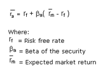
Historically, the “Beta” concept has been closely related to the Capital Appreciation Pricing Model (CAPM)[6]. Here is the definition of CAPM from Investopedia:
“A model that describes the relationship between risk and expected return and that is used in the pricing of risky securities.
“The general idea behind CAPM is that investors need to be compensated in two ways: time value of money and risk. The time value of money is represented by the risk-free (rf) rate in the formula and compensates the investors for placing money in any investment over a period of time. The other half of the formula represents risk and calculates the amount of compensation the investor needs for taking on additional risk. This is calculated by taking a risk measure (beta) that compares the returns of the asset to the market over a period of time and to the market premium (Rm-rf).”
Those who find merit in “Smart Beta” seek out investment variables that hold potential to serve as criteria for the creation of a portfolio that can produce risk-adjusted investment return demonstrably superior to the standard existing “mainstream” indices, (virtually) all of which are “Capitalization Weighted”[7]. Some experts have estimated that well over 90% of all funds invested in equities are tied to one of these Cap Weighted indices.[8]
This is not, by nature, a bad thing. I assure you that index providers who use a cap-weighted methodology are quite capable of offering you an impressive slide presentation that could convince you of the unparalleled virtues of cap weighting. However, I prefer to be a realist about investing, including two obvious realities:
1) Market Cap Indices are vulnerable to amplifying the negative impact of a “Bubble” within a particular stock or sector (such as the Dot.com Bubble) because such large weight is given in the index to stocks that zoom higher! A prime case in point was AAPL during the first 9 months of 2012! Remember when AAPL was a “cinch” to reach $1,000/share? Alas, instead, between September of 2012 and April of 2013, AAPL fell by 45%… proving to be as much “dead weight” within the NASDAQ Index on the way down as it had been a huge lift on the way up!
Another way of viewing this is through the following chart, which dramatically illustrates how “far ahead” the tech heavy NASDAQ (in green) got ahead of “the rest” of the market at the turn of the century:
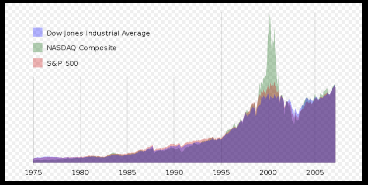
This graph illustrates just how far "ahead" of the rest of the market the "Tech-Heavy" NASDAQ Index moved at the turn of the century!
2) The “Market” is not “Efficient”! Do I need to offer you all the obvious reasons, or can you trust me that the debate regarding “Efficient” vs “Not Efficient” has raged ever since the CAPM model was first presented? If you focus on reading the voluminous literature on this topic, your eyes will glaze over! Instead of getting bogged down in those details, I prefer to approach the topic from an existentialist point of view – remembering the two “Crashes” between 2000 and 2009, all of the “Flash Crashes” we’ve endured, and knowing all too well the extent to which certain players continue to manipulate the market.[9] “Efficient” would not look anything like that!
All of the above being said, the intent of Smart Beta is to identify an investment variable through which to create a non-market cap index that demonstrates a better risk-adjusted return than its benchmarked cap-weighted index.
Let me push the “Pause Button” on investment jargon for a moment and give you a chance to catch your breath! As you do that, here is my “Smart Beta Made Simple” version of the above:
Do you remember Ron Popeil and his legendary “Veg-o-Matic”?! [Of course you do!][10]
When you exclude all the jargon, what “Smart Beta” does is “slice and dice” equities within any given market with the intent to create a portfolio that offers an attractive investment return!
So if/when a story (or sales pitch) about a “Smart Beta” fund catches your eye and you become excited about a seemingly compelling return, take a moment to find out “What” was sliced and diced and “How” it was sliced and diced before you actually buy any shares!!! If you don’t heed my advice, you may experience “buyer’s remorse”.[11] [We’ll come back to this in the “Takeaway” section.]
One popular “Smart Beta” method used to “slice and dice” stocks is referred to as “Low Volatility”. Countless studies have established that this investment variable has been an enduring factor in contributing positively toward risk-adjusted return.
So let’s compare three popular “Low Vol” ETFs with one another and with a mainline index during these periods:
1) April to early June of 2012
2) July 16 to July 31, 2014
3) July 30 to July 31, 2014 (that 317 point drop in the Dow)
4) July 16 to August 7, 2014
We’ll look at returns from these ETFs:
Direxion S&P 500 Volatility Response (VSPY)
PowerShares S&P 500 Low Volatility ETF (SPLV)
iShares MSCI USA Min Volatility (USMV)
Here is a graph of the decline during the 2012 period (note that the dates from high to low are different for the S&P versus the Dow[12]):
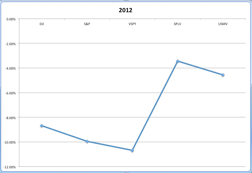
Here is the relative performance of the Dow Jones Index, the S&P 500, and three low volatility ETFs during the downdraft between April and early June of 2012.
We can see that, back in that 2012 period, SPLV and USMV were less than half as volatile as the Dow and the S&P. I strongly suggest discounting the abysmal performance of VSPY, since that ETF was not started until January (2012) and ETF prices are often erratic during their initial months. We’ll see it perform better in the next few graphs.
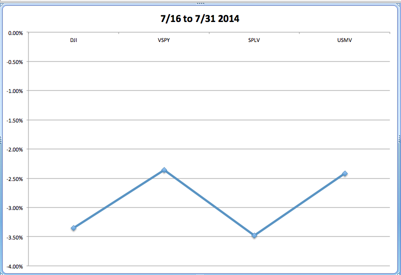
Next is the graph showing losses between July 16 and July 31. We can already see a markedly improved relative performance by VSPY! Both VSPY and USMV offered an approximate 1% outperformance relative to the Dow; while SPLV performed inline with the Dow.
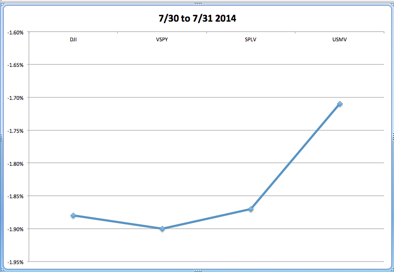
With the caveat that relative performance over just one trading day is of only limited value, here are the results from July 31st:
VSPY and SPLV largely tracked the Dow, while USMV offered an approximate 15 basis point outperformance.
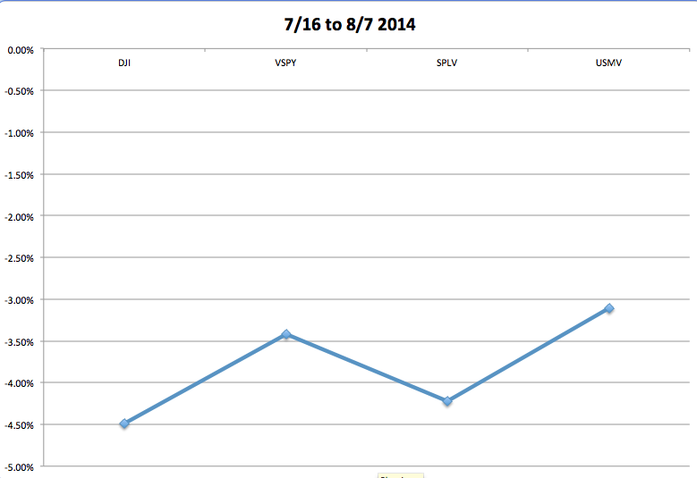
Finally, here is the chart covering the entire recent high to low move (July 16 to August 7):
During this period, these ETFs outperformed the Dow by the following amounts:
VSPY 107 basis points;
SPLV 27 basis points;
USMV 138 basis points.
So that is a very brief (and perfunctory) view of these ETFs vis-à-vis “the Market” during a few recent periods of decline! How have they performed over the course of longer periods?
Here is a view of the three ETFs vis-à-vis the Dow since the inception of VSPY at the beginning of 2012.[13]
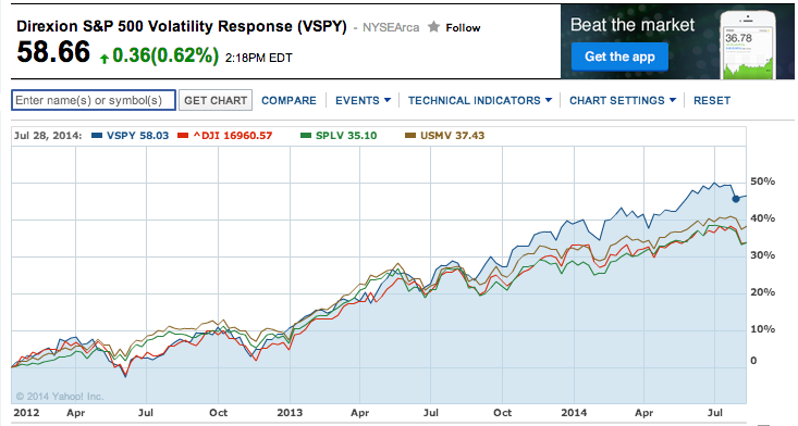
Here is a graph of relative performance for the Low Vol ETFs vs the Dow Index since the inception of VSPY in January of 2012.
The order of performance here is as follows (percent return is only approximated based on graph):
VSPY about 48%
USMV about 39%
SPLV about 34%
DOW about 34%
And for the year to date (a period that commentators I have read regularly call “challenging” for professionals and amateurs alike) here is a graph:
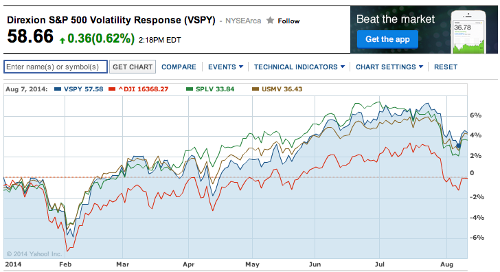
Here is the identical graph, except for the period of January through the beginning of August, 2014.
VSPY and USMV Up about 4.0%
SPLV Up about 3.8%
DOW about Break-even
I should hasten to add that even experts advise caution regarding how favorable the Market has been during the past two-three years for “Low Vol” funds. No one can or should assume that such a trend will continue.
Instead, the “normal” pattern is that “Low Vol” funds show solid “upside capture” of equity “Beta” when the equity markets move up relatively modestly, but will lag the major indices during times of strongly bullish performance.
On the other hand, “Low Vol” funds will outperform the market cap indices during periods of mild to strong declines![14]
I believe that one of the reasons “Low Vol” has been recently outperforming is that investors want to manage their downside risk – resulting in higher demand for “Low Fund” funds!
Here is a brief look at how the ETFs are constructed:[15]
1) VSPY – Direxion Investments appears to utilize the most dynamic methodology in managing its ETF portfolio.[16] Here is the “Index Description”: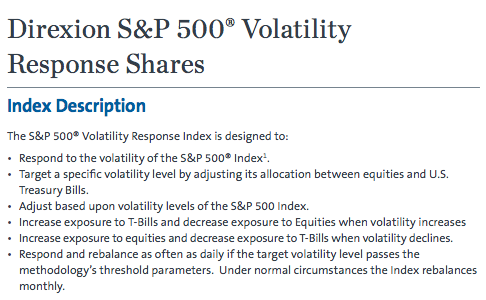
- This is a description of the VSPY Index.
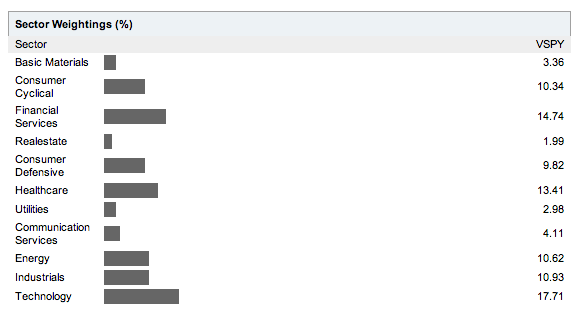
The sector weightings for VSPY are as follows:
VSPY reports Assets Under Management (AUM) of over $23 million. The ETF reports a P/E of 17, a yield of 1.47%, and a (steep) Gross Expense Ratio of 1.78%. However, that expense is subsidized to reduce it to a “Net Expense Ratio” of 0.45%. This ETF rebalances its portfolio monthly! For more details, go to http://www.direxioninvestments.com/wp-content/uploads/2014/01/VSPY-Fact-Sheet.pdf .
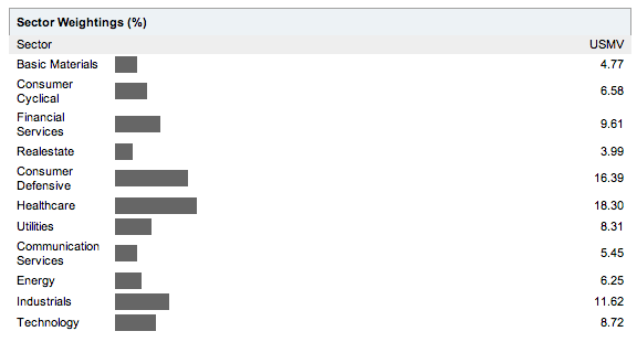
iShares (by BlackRock) manages USMV – with AUM exceeding $2.6 billion. It reports a P/E of 19, a yield of 2.28%, and an Expense Ratio of 0.15%. The ETF re-balances its portfolio semi-annually. Sector weightings for USMV stand at:
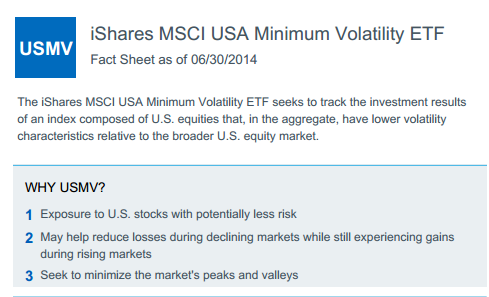
Here is a brief description of USMV from iShares:
For more details check out: http://www.ishares.com/us/literature/fact-sheet/usmv-ishares-msci-usa-minimum-volatility-etf-fund-fact-sheet-en-us.pdf.
Finally, SPLV is managed by PowerShares (Invesco), and boasts AUM of $4.5 billion, a yield just under 2.5%, a P/E of 17, and an expense ratio of 0.25%. SPLV rebalances the portfolio on a quarterly basis.
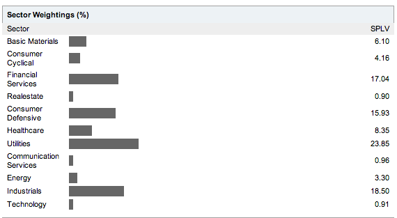
Sector weightings are reported as:
INVESTOR TAKEAWAY:
Minimum Volatility funds have been among the most popular investing options during the past couple of years. Many tens of thousands of investors are still “gun shy” because of a vivid memory of the 2007-09 market “Meltdown”! Now that that the equity markets are near an all-time “high” and there is chatter on CNBC (almost) everyday regarding when the Federal Reserve will (finally) start pulling liquidity out of the U.S. economy, it is no wonder that an investment option that purports to provide positive market “Upside Capture” while simultaneously offering “Downside Risk” is garnering billions of dollars in funds!
Only you can determine if this “Smart Beta” option makes sense for your situation!
Let me offer one more though with the aid of Ron Popeil! If you are intrigued by “Low Vol” ETF funds, please do a thorough review of how each fund “Slices and Dices” stocks to produce a portfolio! Never ever assume that all “Low Vol” funds are alike!! They are decidedly not all alike (just like “High Dividend” funds are each a bit different from the others!). If you review VSPY, SPLV, and USMV, I suggest that you focus (in particular) on these factors:
1) Sector Weightings – they are quite different. SPLV has high allocations to Utilities, Industrials, and Financial Services. In contrast, USMV is most heavily weighted in Healthcare, Consumer Defensive, and Industrials. VSPY has a markedly different allocation – including 17.7% in “Technology” (more in line with the S&P and rather surprising for a “Low Vol” fund). When “Tech” leads the market, VSPY will benefit; but when “Utilities” are at the forefront (as earlier this year) SPLV will get an extra “kicker”!
2) Total assets – both USMV and SPLV manage “billions”, so they are more liquid than VSPY (under $300 million);
3) Yield – if this factor is of importance to you, VSPY has a yield about 80 basis points less than USMV and 1% less than SPLV.
4) Frequency of Re-Balancing: some experts point out that a regular “Re-Balance” policy contributes mightily to limiting the ill effect of “bubbles” and “market distortions”. Put simply, it helps execute the discipline of “selling high and buying low”! Each of these ETFs rebalance – but at different intervals!
5) Expense Ratio: for most of you, this is an arcane point. However, if VSPY ever decides to reduce its expense subsidy, you’ll have a very expensive fund on your hands. The key metric to watch here is this – does the Smart Beta produce a risk adjusted return high enough to compensate you for an “Expense Ratio” considerably higher than the 5 basis point ratio of VOO (Vanguard S&P 500 ETF) or the 9 basis point expense ratio of SPY (SPDR S&P 500 ETF)?
DISCLOSURE: The author is intrigued by all Smart Beta products but continues with his (soon to be famous) “Ron Popeil” analysis of how each strategy “Slices and Dices” equities to create a portfolio! Therefore he does not own VSPY, SPLV, or USMV. Nothing in this article is intended as a recommendation to buy or sell anything. Always consult with your financial advisor regarding changes in your portfolio – either subtractions or additions.
FOOTNOTES:
[1] Don’t we investor folks know how to have fun?! Let me hasten to add that if I had only been long stocks, the 331 point drop would have been less stressful. But as Bull Put investors know, “leverage” can raise the blood pressure a lot faster than just “straight stocks”!!
[2] No one mentioned Janet Yellen not feeling well… but that will be an excuse someday! Trust me!
[3] October 19, 1987
[4] Feel free to apologize for calling me a “Wimp”!!
[5] The topic of this Panel Discussion was a classic “Smart Beta” oriented topic: “Low Volatility Versus High Dividend: Which One Is Better?”
[6] A theoretical model also tied to the “Efficient Market Thesis”… and although investment theorists living and dead will object strenuously to my skepticism (those who are dead are at this moment rolling over in their grave), I personally believe that the “Dot.com Crash” and the “Mortgage Crisis Crash” are sufficient reasons for us to be quite suspicious about anyone who insists the “Market” is “Efficient”!
[7] “Cap Weighted” means that the individual components of an index are weighted according to the market cap of each component. For example, the top two constituents of the S&P 500 are Apple Inc (AAPL) and Exxon-Mobil (XOM)… that carry relative weights within the index of 3.36% and 2.46% (respectively).
Other Market Cap Indices include NASDAQ, Wilshire, Hang-Seng, and EAFE. The Dow Jones Industrials is actually “Price Weighted” – but that methodology has much the same impact on index distortion as Market Cap”.
[8] One expert suggests that number is 95%!
[9] I will note that, for those players, the “Market” may be “Efficient”!!
[10] For all of you that need a “Ron Popeil Fix”, here are some memories: https://www.youtube.com/watch?v=7l7pLgLAz7s
[11] Because of a failing family member, I have spent many meals lately staring at her plate of all pureed food, mystified by what was actually slice, diced, and blended to produce it.
[12] The Dow (based on closing price) was off by almost 9% between April 1 and June 4; while the S&P 500 declined by 9.94% between April 2 and June 1
[13] VSPY is the youngest of the three!
[14] Just as they are designed to perform!
[15] IMPORTANT NOTE: because the websites for these ETFs each report different categories of facts, I relied upon YahooFinance.com for much of the fund metrics! (As an example, I couldn’t find rebalance frequency within the iShares USMV webpage!)
[16] Keep in mind that “dynamic” is neither a positive nor negative term in this sense!
Related Posts
Also on Market Tamer…
Follow Us on Facebook


 Why Pony AI Skyrocketed This Week