Traditionally, the end of each calendar year has served as a natural time for the average person to pause and reflect upon the past, as well as anticipate the future. In particular, millions of folks engage in some form of evaluation process – reviewing such things as “what went well”, “what did not go well”, “what changes can I make to improve myself”. Of course, that last topic often ends in the creation and adoption of one or more “New Year’s Resolutions”.
 As investors and/or traders, we can each benefit from that same discipline – looking backward and forward for a time of review and potential growth.[1] Experts recommend that if one has not already reviewed profits and losses in detail at the end of each month or quarter, one should definitely perform a detailed review of the year’s trading activity at the end of December and/or the beginning of January. Discover those areas within which you achieved your greatest successes, as well as those areas within which you may need to modify your trading plan or your preferred investment vehicles.[2]
As we review 2013, we are reminded that, as major indices approached and exceeded former highs, the question that most captivated investor and media interest was: “How much higher can we go?”
To address that question, let’s consider some metrics. If one accepts a definition for the end of a bull market as a 20% correction, then the current bull market is approximately 57 months old. So how long is the “average” bull market. The answer to that question is: “that depends”! It depends upon the parameters one chooses in calculating the length of a bull market.
A helpful example of the variability that can be involved within such an analysis can be found in the article found at http://asymmetryobservations.com/2013/09/16/the-real-length-of-the-average-bull-market/ — within which Mike Shell exposes the empirical flaw in one standard analysis that concludes the average bull market lasts 50 months.[3] Shell also described a study by J.P. Morgan Chase (JPM) that determined the average bull market lasts 68 months, a calculation at least as flawed as the first. Shell then highlights an alternative analysis that identifies the average life of a bull market as 39 months – an analysis that I find much more convincing.
Therefore, let’s assume that 39 months is the most reasonable metric. In that context, the current bull market has extended almost 50% beyond its average (normal) lifespan (about one and one-half years beyond that average!). That sounds a bit “long in the tooth”. From a risk management point of view, it is incumbent upon all traders/investors to keep a wary eye upon the possibility of an over-extended market that is vulnerable to a downdraft.
That brings us to a relatively new metric called the Chicago Board of Exchange (CBOE) “Skew Index” – the primary subject of this article. The narrative that follows is my attempt to make a mathematically complicated concept as simple to understand and utilize as possible.
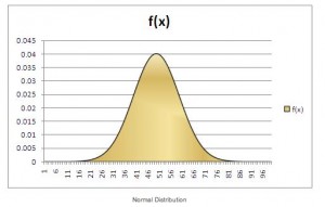
The “back story” behind SKEW begins in October of 1987. Before October 19th, most market analysts conceived of the stock market as a system that generates returns that, if graphed, would resemble the curve of a “Normal Distribution”, such as this:
 However, on October 19, 1987, something happened that forever transformed our understanding of the stock market. That day, the Dow Jones Industrial Average plummeted by 508 points, or 22.06%, in just one day – forever known since then as “Black Monday”!
Suddenly, existing assumptions about “normal distributions” and risk had to be thrown out the window and reformulated.
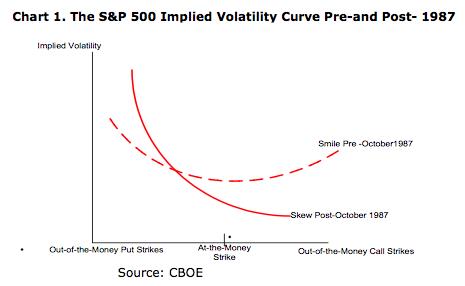
One assumption that had to be totally revised was the assumption that the implied volatility of equity options (puts and calls) at equal distances from the actual market price of any given security would, by nature, be equivalent. Therefore, on a chart, the S&P 500 Implied Volatility Curve appeared as a “Smile” prior to “Black Monday”.
That changed dramatically after “Black Monday”, with the curve then reflecting a dramatically higher slope upward on put volatility!! [See the following graph:]
 This story provides us with a great example of how the “unexpected” often wakes us up to reality. There are any number of reasons why stock returns can not be expected to reflect a “Normal Distribution”, including at least the following:
1) The “Normal Distribution” expects that there is no built in bias (preference) at either end of the curve (either higher or lower than “average” returns). That can not be the case with stocks because:
a. No security price can fall lower than $0, so there is a limit on downside loss;
b. The stock market will always be subject to the impact of “Herd Mentality” – most often manifested when selling begets more selling (such as “Black Monday”, the “Flash Crash”, our many “mini-Flash Crashes” (in individual securities), etc.
c. Investor perception of “risk”: Except for confirmed short sellers, most traders/investors view “risk” only in terms of price movement to the downside. Therefore, volatility curves will inevitably be skewed to the downside.
2) Results from empirical market studies:
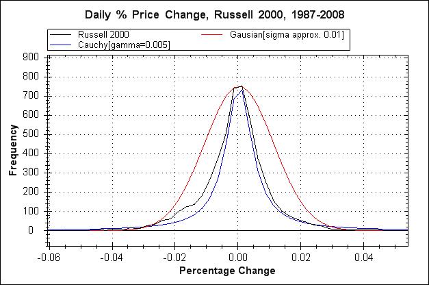
a. Here is a graph of the returns from the Russell 2000 Index vis-à-vis a “Normal” (aka “Gaussian”) Distribution. We clearly see that actual returns are not “Normal”.
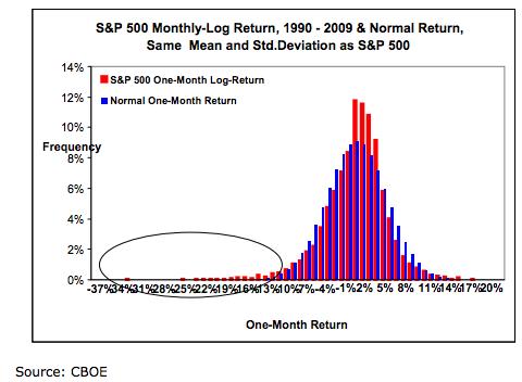
b. A graph of actual S&P 500 returns vis-à-vis a “Normal” Distribution also shows a significant “left tail“
 As market analysis evolved, various measures of risk have emerged. The metric about which we hear most often within the financial media is the “Volatility Index”[4] – quite often referred to as a “Fear Index”. It is in this context that, with all due respect to the financial media, I suggest that the CBOE SKEW Index is a more effective and helpful metric through which to track either risk or fear.
According to the CBOE, SKEW is an option-based metric designed to measure the perceived risk of “outlier” returns within the window of the following 30 days – with “outlier” referring to returns that are more than two standard deviations below the mean. Expressed in simpler terms, it is designed to measure the perceived risk of a nearby stock market tumble or crash. Now that is what I call a risk metric!!
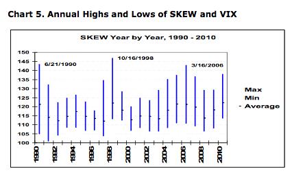 Let’s gather some measures through which to interpret SKEW readings. Here is an account of the annual SKEW high and low levels between 1990 and 2010:
Here is a data compilation of the frequency of SKEW levels between 1990 and 2010:
As we can see, the most common SKEW levels during that period ranged between 112.50 and 122.50.
Then, we have a data chart that reports the probability that the S&P 500 will fall two standard deviations or three standard deviations in price from a given SKEW level!
From this data, we can recognize that a SKEW level of 100 is as low as the Index can go, and reflects the least apparent level of risk!
As a corollary, a level as high as 130-145 reflects the highest apparent degree of market risk.[5]
Right about now, I sense you are wondering what our current SKEW Index readings show! Below is a look at daily SKEW Index levels on a Year-to-Date (YTD) basis:
Not surprisingly, the trend has been upward since mid-year – especially since September.
Here is a chart of the weekly SKEW between March 2011 and now:
Other than a spike upward in March of 2012, SKEW was relatively tame until the fall of 2013!
Here is a slightly different way of looking at SKEW. The graph below displays SKEW between March of 2011 and the present… with a Keltner Channel drawn to dramatize periodic spikes in the Index:
And here is the same time frame, but with important detail added (SKEW reached an extremely high 143.19 level on December 16th of this year!).
Here is some additional contextual information for you as a help interpreting the SKEW Index:
1) Between 1990 and 2010, SKEW reached a low of 101.09 on March 21, 1991; that period marked the end of the recession that had started in July of 1990.
2) In contrast, SKEW reached a high of 146.88 on October 16, 1998… during the Russian Crisis and the day following an unexpected Federal Reserve Board announcement that it was lowering the Fed Funds Rate and the Discount Rate.
3) It is worth noting that SKEW was high in March of 2006, during a period of great concern regarding the possible bursting of the housing “Bubble”.[6]
Finally, for any of you who are diehard VIX aficionados, here is a chart that compares the VIX with the SKEW between January 1990 and February of 2012. As we suggested early on, SKEW is a very distinct metric; the two metrics are not easily or directly correlated.
With that being said, it can be suggested that SKEW has foreshadowed a VIX spike at a couple of significant points during this period (see especially the right side of the chart).
INVESTOR TAKEAWAYS: With the stock market at new record highs, the current bull market clearly being “long in the tooth”, the “Santa Claus Rally” safely behind us now, and the benchmark 10-Year U.S. Treasury rate having popped above the 3% level, it would not seem to be out-of-line to point out that our current market risk levels are much higher than “normal”. That is, in fact, what the relatively high SKEW levels we have seen in December are telling us!
So please keep these thoughts in mind:
1) The December 16th reading of 143 is just shy of the “all-time” level reached in the SKEW.
2) That level is also higher than the October 13th SKEW level – when the markets were in turmoil due to the politicians in Washington, D.C. once again demonstrating an inability to govern effectively!
3) The SKEW suggests it is relatively expensive to purchase protection via out-of-the-money (OTM) puts!
a. That does not mean you should not purchase such protection, it only means that you need to be aware that premiums are presently higher than normal.
4) If Market Tamer utilized traffic light logos as a means to measure risk (which it doesn’t because that methodology would be too simplistic), the current “Traffic Light” would be flashing some shade of Reddish Yellow. A high level of alertness and caution is warranted!
Given the above, you might wonder what an effective method of hedging might be. It would be reasonable for you to consider any or all of the following strategy options. Your choice would depend upon your own risk tolerance, financial goals, and unique financial circumstances!
1) Take profits in current positions; invest in cash or very short-term fixed income vehicles.
2) Utilize very careful risk management as you place orders for new positions
A. For example, buy or sell a lower number of shares than normal;
a. Target a lower level of “maximum loss”;
b. Utilize smaller spreads (i.e. reduce 10 unit spreads to half that size (5 unit spreads!!)
c. Consider buying ETFs that are based upon a “Bear Equity Index”
i. Such options might include ProShares Short S&P 500 (SH) or ProShares UltraShort S&P 500 (SDS) and/or Direxion Shares Trust 3X Bear ETF (FAZ) or Direxion Shares Trust Daily Small Cap Bear 3X Shares (TZA)…. or any of a plethora of other choices. Just make sure your choice has adequate liquidity (Open Interest).
B. As an alternative, one could consider selling bull put spreads on any of the “Short Equity” ETFs with which one feels comfortable. That provides a measure of “hedging” while sparing you from “owning” a wasting asset (due to the theta decay that comes with owning call options… or put options, for that matter). [7]
DISCLOSURE: The author currently owns a bull put spread in SDS, and will be content to own SDS if it gets put to him. Nothing in this article is intended as a recommendation to buy or sell anything. Always consult with your financial advisor regarding changes in your portfolio – either subtractions or additions.
[1] It is well worth noting that the month of “January” derives from ancient Roman myth/religion, that named the first month for “Janus”, the god of beginnings and endings. Traditionally Janus is pictured as having two faces… one directed to the past, the other to the future.
[2] In this regard, many investment firms allow you to download your trading activity into a worksheet, from which you may sort the investment data by ticker symbol, date, “buy” or “sell”, etc. Analyze the data as many different ways as you can, and then focus on those metrics that appear to provide the productive insights as you look ahead to 2014.
[3] That analysis claims to be derived from S&P 500 data that goes back to 1871. The flaw lies in the fact that S&P 500 figures were not published until 1957.
[4] Including the many and varied manifestations of the Volatility Index (VIX, VXX, VXN, VXO, VXD, etc.)
[5] Full disclosure requires me to emphasize that a reading of 100 does not mean there is no risk of a FAT TAIL return (or “Black Swan” event). Nor does a SKEW Index reading of 145 ensure that a FAT TAIL return is either imminent or inevitable.
[6] Great question, my friend! Why exactly wasn’t the FED, Congress, or the President doing anything THEN to ensure any future Bubble could be managed?!
[7] The experienced among you don’t need to be reminded that a “bull put spread” in an ETF such as SH means you are “bearish” on the S&P 500 Index!!
Related Posts
Also on Market Tamer…
Follow Us on Facebook


 Is IonQ Stock a Buy?